New charity website design transforms community visibility and increases donor support.
The goal centred on establishing a central hub for the charity. This meant creating an informative space where attendees can learn about the gathering. Visibility needed to match the scale of their physical assembly, which brings thousands together annually in Central London.
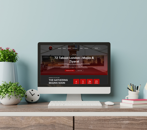
Visitors now navigate essential event updates and donation routes without friction. Layouts look modern and responsive on mobile viewports. Clear pathways remove confusion, so the community finds schedules, scholar endorsements, and registration links instantly from any device they use.

The new setup directly helps the foundation gather crucial support. Streamlined contribution workflows make giving simple and secure. This shift translates to improved funding for lectures, food distribution facilities, and volunteer management during their large-scale annual religious gathering.
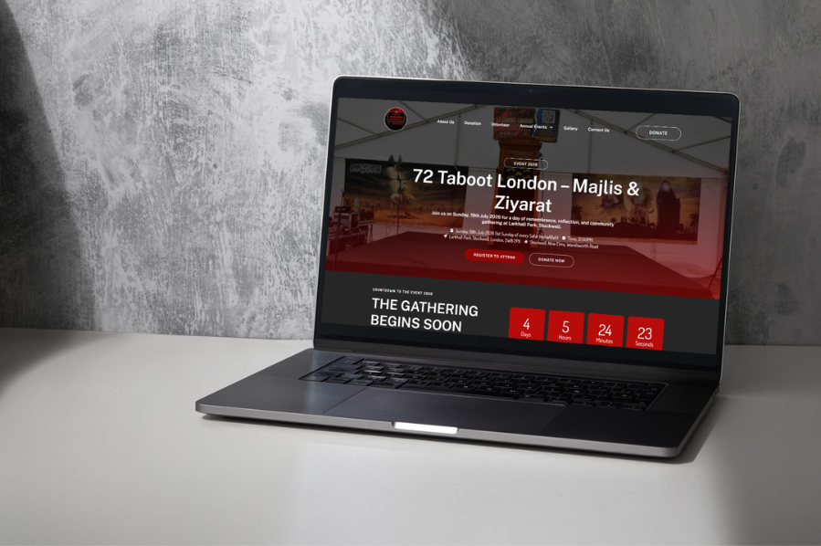
The 72 Taboot London Foundation runs a prominent annual religious gathering in Central London. This event attracts roughly 5,000 attendees for an expansive day of remembrance, community unity, and learning. The assembly features distinct spaces for families, lectures, and necessary food stalls to serve visitors.
The main goal was to drive public awareness and increase direct donations to fund the annual logistics. The foundation required a trustworthy platform that houses historical context, upcoming event schedules, and scholar endorsements. They wanted to make the volunteering registration straightforward to increase hands-on support. Creating a smooth, visible donation flow throughout the layout was critical to sustaining their charitable initiatives.
Before this project, information remained scattered across offline methods, making it difficult for the public to find official updates. Potential donors lacked a secure, direct channel to contribute electronically, which restricted funding opportunities. Coordinating 5,000 attendees and recruiting helpers became inefficient without an automated central system to manage enquiries and registrations.
Placed clear contribution calls across every single section. This makes giving a natural next step for any website visitor.
Established direct connections with international merchant systems. Donors complete transactions using preferred local payment methods safely and immediately.
Introduced clear event highlight components on the main banner. Visitors quickly grasp the upcoming dates and the remaining time left.
Formatted specific grid spaces to display video updates and event imagery. This builds deep credibility for first-time site visitors.
Created separate forms tailored specifically for event registrations and volunteer intakes. This removes unnecessary administrative delay for foundation leaders.
Structured all designs to change size based on the user’s hardware. People read layout updates clearly while walking or travelling.
Every single footer repeats core engagement pathways. Visitors can choose to donate or sign up regardless of what page they finish reading.
Created spaces designated for religious scholar letters and formal updates. This strengthens public confidence and validates the organisation’s regional credibility.
Used high-quality historical image galleries to showcase the massive physical scale. Seeing past turnouts reassures new donors of their contribution value.
Arranged the narrative architecture to address immediate attendee needs first. Venue locations, contact telephone numbers, and key dates receive immediate visual priority.
Removed redundant text fields from data collection points. Short inputs encourage immediate action and reduce visitor drop-off during the registration phase.