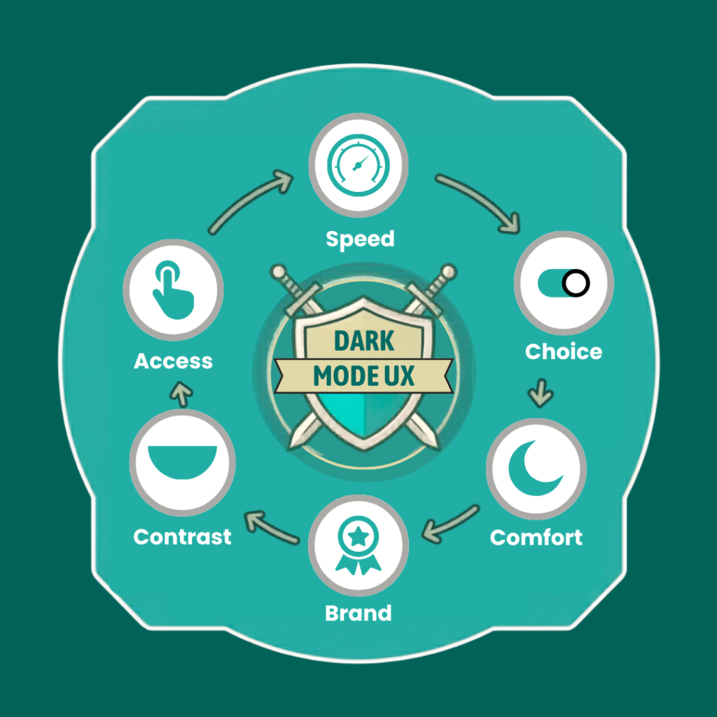


Introduction
A website can look great and still feel wrong. A bright white screen at midnight is one simple example. The user opens your site, feels the glare, and starts looking for another option. There is no major error. The page works. The content is useful. Yet the experience does not feel right.
That is why dark mode has become a bigger part of web design. Users now switch between light and dark themes on phones, laptops and apps. They are used to having more control over how digital products look. Websites are now part of that same habit.
This does not mean every visitor wants a dark screen. It means people value choice. Good dark mode website design should do more than change a white background to black. It should support clear text, easy navigation, strong contrast and a smooth user journey. It should also fit the brand.
So, is dark mode now a must-have? Not always. But for many websites, it is worth a closer look.
Table of Contents
Why Users Choose Dark Mode
In short, there are several reasons for people’s preferences. For some, the design looks better than normal mode. For others, low-light environments are better with this mode. And, for a few, it is simply easier to work at night. In the end, it is all a matter of personal preference.
The 2019 UI study mentioned above gathered results from more than 1,500 users. 88% of all users who took part in the study therefore used dark mode at least some of the time. 53% sometimes chose dark mode when it was available.
The study was self-reported and should not be treated as a 2026 market figure, but it shows how strong the interest was even then.
Comfort in Low-Light Environments
Think about how you use your phone late at night. A bright screen can feel out of place in a dark room. A darker layout may feel more in tune with the space around you.
This is one reason dark mode user experience needs to be linked to context. The same design may feel great in one setting and less useful in another.
It is also why claims about dark mode need care. A dark screen is not a cure for eye problems, and it does not work better for everyone.
Personal Preference and Visual Style
Some users simply like dark interfaces. A darker palette can also give a site a bold look. It can suit brands in tech, gaming, media and creative fields. But the style should still support the content. A dark layout that looks impressive but makes text hard to read is not good design.
Better Control Over the Browsing Experience
Users now expect more control over digital products. Theme selection is a small feature, but it can make a site feel more personal. A good dark mode user experience gives users that choice without making the site harder to use.
A strong web design service should look at more than colour. It should consider how people move through the site, what they need to see first, and what helps them take action.
What a Good Dark Mode Website Actually Looks Like
A good dark theme is not a colour swap. The designer needs to rethink the whole visual system.
A common mistake is to take the light version, reverse the colours and call it done. That can lead to harsh text, weak buttons and poor contrast. Good dark mode website design starts with a separate set of colours, surfaces and states.
Do Not Just Invert Your Existing Colours
Pure black is not always the best background. A softer dark grey can create space between the page, cards and content areas. Accent colours may also need to change so they remain easy to see.
Buttons, links and icons need fresh checks too. The goal is simple: every important element should still be clear.
Make Text Easy to Read
Text is where weak dark themes often fail. White text on a black background can look too strong when used everywhere. Small text can become harder to scan. Thin fonts may also lose clarity.
Use clear type, enough spacing and good contrast. Check headings, body text, links and form labels on their own. Do not assume one setting works for all.
Protect Your Brand Identity
Going dark does not mean losing your brand. Your logo, colours and key design details should still feel familiar. Some brand colours may need slight changes to work well on a dark surface. The best dark mode website keeps the brand strong in both themes.
Dark Mode UI: The Elements That Need Extra Care
The main page may look fine, but small interface details can still fail. That is why dark mode UI needs full testing.
Navigation, Buttons and CTAs
Menus should remain easy to see. Buttons need clear states. Users should know when a button is active, selected or disabled. Focus states are also vital for keyboard users. Do not let the CTA fade into the background just because the theme changed.
Forms, Cards and Content Sections
Forms need special care. Input fields, borders and labels must remain clear. Error messages should not rely on colour alone. Cards need enough contrast to stand apart from the page. A careful dark mode UI keeps these small details clear.
Images, Icons and Media
Some logos and icons work well on light backgrounds but disappear on dark ones. Transparent images can also cause problems. A light logo may vanish. A black icon may become almost invisible. Every key visual asset should be checked in both themes.
Dark Mode UX: Where Many Websites Get It Wrong
A theme switch alone does not create good UX. Good dark mode UX starts with user needs and keeps the full journey in mind.
Give Users a Clear Choice
A theme toggle should be easy to find. You can also let the site follow the visitor’s system preference. For some sites, that may be the simplest option. The important thing is not to make the user search for the setting.
Keep the Experience Consistent
The theme should work across the whole site. Do not support dark mode on the homepage and then switch back to a bright layout on the contact page. The same problem can happen with forms, pop-ups, menus and checkout screens. A smooth experience should feel like one site.
Test More Than the Homepage
Test key pages on real devices.
Look at:
- Homepage
- Service pages
- Blog pages
- Contact forms
- Landing pages
- Mobile menus
This is where real issues often show up.
Dark Theme Website Design and Accessibility
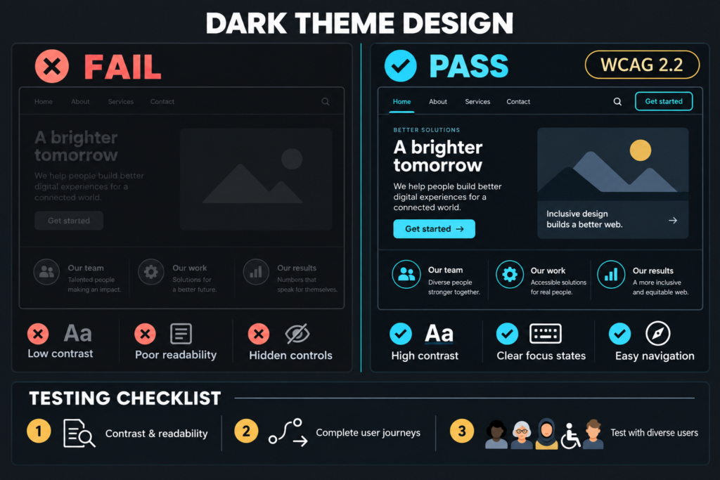
A dark interface is not automatically an accessible interface. A dark theme website still needs good contrast, readable text, visible focus states and clear controls.
Accessible websites should be usable by as many people as possible. At least 1 in 5 people in the UK have a long-term illness, impairment or disability, and accessibility guidance recommends using WCAG 2.2 AA when checking a website.
It also advises teams to make new features accessible from the start. That is a useful rule for any business website. Test both themes. Check the full journey. Fix issues before launch.
How to Add Dark Mode Website Design Without Hurting Conversions
A website still has a job to do. It may need to generate leads, sell products, drive calls or get users to fill in a form. Theme choice should support that goal.
- Keep Conversion Paths Clear: Your main CTA should stand out in both themes. Forms should remain simple. Phone numbers, enquiry buttons and trust signals should be easy to find. The theme should never hide the next step.
- Protect Page Performance: A theme switch should not make the website slow. Keep scripts light. Use efficient assets. Test on mobile devices and weaker connections. A fast website is still a key part of good web design.
- Measure Before and After: Do not rely on opinion alone. Look at engagement, form completions, CTA clicks and other useful actions. Compare results before and after the change where possible.
Conclusion: Give Users a Choice, Not a Constraint
Dark mode is not going away. But that does not mean every business should add a dark switch tomorrow. The smarter move is to understand your audience first. Then test the design, check accessibility and measure the result.
At Midland Marketing, our website design services focus on building clear, useful websites that work well for real users.
A strong website does not force users to work around it. It gives them a clear, easy path. In 2026, that may include a darker theme. What matters most is making the site feel right for the people using it.
Frequently Asked Questions
- Is dark mode website design better for users?
It can be better for some users, especially in darker settings or for people who prefer dark interfaces. But it is not better for everyone. The best approach is to offer a clear choice when it adds real value.
- Does every website need a dark mode?
No. A dark mode website can be useful, but it should fit the audience, brand and content. Adding it without proper testing may create more problems than it solves.
- What is the difference between dark mode UI and dark mode UX?
Dark mode UI focuses on the visual parts of the interface, such as colours, buttons, text and cards. Dark mode UX looks at the full experience, including choice, navigation, consistency and ease of use.
- Is a dark theme website more accessible?
Not by default. A dark theme website still needs strong contrast, readable text, keyboard access and clear focus states. Accessibility depends on the full design, not the background colour alone.
- How should businesses implement dark mode in 2026?
Start with user needs. Build both themes with care, respect system preferences where suitable and test the full site. Good dark mode website design should support accessibility, usability, brand identity and conversions at the same time.

Written by - Lauren Davison
Introducing Lauren – one of our content writers who has a flair for SEO and creative strategy!
With a Master’s Degree in Creative Writing, Lauren has niched down into SEO and content writing.
Outside of work, she loves watching the darts, reading and the pub on the weekend.
Want some more?
Latest Insights & News

5 Data-Driven Email Automation Workflows for UK Consumers
Introduction Email remains one of the best ways to connect with customers. In the UK, people expect brands to send useful messages at the right
How UK Digital-Native Brands Build a Meta Ads Account Structure for Scale
Introduction Most people decide whether they trust a company within seconds of landing on its homepage. Not minutes. Seconds. That’s the reality UK tech startups
Dark Mode Website Design 2026: How to Improve UX Without Hurting Conversions
Introduction A website can look great and still feel wrong. A bright white screen at midnight is one simple example. The user opens your site,