Clear fulfilment messaging that drives stronger enquiries
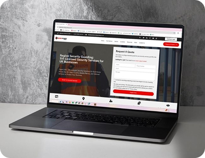
Hi-Express needed a website that clearly explained its logistics and fulfilment model without overwhelming visitors. The goal was to simplify complex logistics into a structure that business owners could quickly understand, compare, and act on.

The layout focuses on clarity and flow. Key information such as pricing, dispatch timelines, and service scope is surfaced early, helping users move through the site without confusion or unnecessary friction.

The website was built to convert interest into enquiries. Every section supports decision-making, making it easier for growing ecommerce brands to assess fit and take the next step with confidence.

Hi-Express is a UK-based ecommerce fulfilment provider supporting brands with pick, pack, and dispatch operations. The business focuses on transparency, reliability, and operational clarity for growing retailers.
The primary goal was to present a clear, commercially focused offer that would resonate with businesses shipping consistent order volumes. The site needed to communicate pricing, service structure, and operational capability without requiring further explanation. Another key goal was to improve enquiry quality. Instead of attracting general interest, the website needed to speak directly to businesses that matched the ideal fulfilment profile.
The existing messaging made fulfilment feel complex and difficult to compare. Important details such as pricing, returns handling, and reporting were not clearly positioned, which created hesitation. Early on, there was also a shift in direction. The initial version we created was structurally strong, but it didn’t fully reflect the client's vision for the brand. Rather than pushing it through, the approach was revisited and reworked to better align with their vision. That change made a clear difference. The final site felt more consistent with the brand, which improved how the messaging landed and how easily visitors could engage with it.
The pricing model was positioned early and explained simply, reducing uncertainty and helping visitors quickly understand the commercial value.
Content was structured to follow how buyers think, moving from service overview to detail, then into proof and conversion points.
Unnecessary complexity was removed, allowing users to find key information without searching or second-guessing.
Each fulfilment service was broken down into straightforward sections, making the overall offering easier to understand and compare.
Operational metrics and retailer associations were surfaced to reinforce reliability and reduce perceived risk.
Call-to-action placements were aligned with user intent, making it easier for qualified visitors to take the next step.
The flat-rate pricing model was used as a central hook, helping the business stand out and making cost expectations immediately clear.
Messaging was aligned to businesses shipping consistent order volumes, improving relevance and filtering out low-intent traffic.
Performance metrics were integrated into the content to support claims and build confidence in the service.
Technical fulfilment language was replaced with clear, direct explanations that are easier for business owners to understand.
Content was structured to answer key questions early, reducing the need for follow-up and speeding up the enquiry process.
A direct, professional tone was maintained throughout, reinforcing credibility and aligning with the target audience.

WhatsApp us