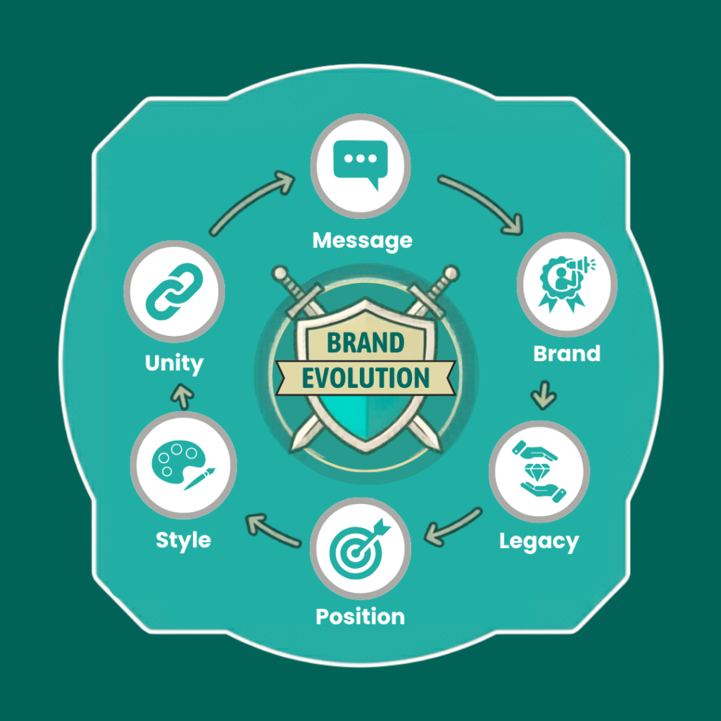
Making complex financial protection sound clear, warm, and human.
Olive Tree Wealth Management wanted a website that felt human, moving away from stiff financial brochures. We set out to mirror their actual office hospitality, making sure their deep protection expertise felt clear, warm, and highly motivating for new local enquiries.
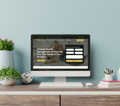
We opted for a calm, spacious layout that makes browsing feel entirely effortless. Insurance decisions get overwhelming fast when text piles up, so we organised the navigation to let people find exact family or business cover options without any mental friction.

The completed website gives the firm a highly credible digital home across Yorkshire. It breaks down complex pension and care rules into friendly milestones, changing how people interact with the business and making them far more comfortable reaching out for advice.

Olive Tree Wealth Management offers financial planning, wealth management, pensions, savings and investments, taxation, and a full range of protection services. That breadth is a strength, but it also creates a challenge: if the website is not organised properly, the visitor can lose the thread very quickly.
The client wanted a website that sounded just like a face-to-face chat over a cup of tea in one of their local offices. The main goal was to split their services into separate pages so each reader could find exactly what they needed. They also needed to show their official regulatory info clearly without making the whole site look like a dry legal document.
Most financial websites use the exact same copied phrases, making them look identical. The challenge was to strip away those generic paragraphs while keeping the details completely accurate. Plus, delicate subjects like long-term care needed a total rewrite, shifting the focus away from "protecting the money" and toward personal choices, comfort, and family relief.
Olive Tree now sounds like a personal adviser rather than a faceless corporation, focusing heavily on why its local guidance matters.
We grouped scattered insurance options into distinct paths, letting users jump straight to personal planning or later-life care options.
We replaced dry technical jargon with natural, grounded prose, keeping complex inheritance and policy descriptions easy for anyone to follow.
Every service page resolves a specific family concern before highlighting the next step, acting more like a helpful guide than a flyer.
We blended regulated statuses and professional milestones directly into the main stories, quietly reinforcing consumer trust without interrupting the friendly narrative flow.
Inbound contact links sit exactly where questions naturally peak, making it incredibly simple for users to drop a message or call.
The positioning frames the firm as an expert voice for both commercial and domestic protection, removing abstract corporate bragging entirely.
Separating pages gives individual insurance policies room to breathe, preventing different services from bleeding into confusing, generic walls of text.
The tone stays entirely supportive, avoiding aggressive sales language and focusing instead on clear options, dignity, and steady household decision-making.
We built specific Yorkshire hubs into the narrative flow, making the firm feel completely accessible to high-street communities.
Page architectures map directly to conversational searches people type online, answering specific worries long before a user fills out a form.