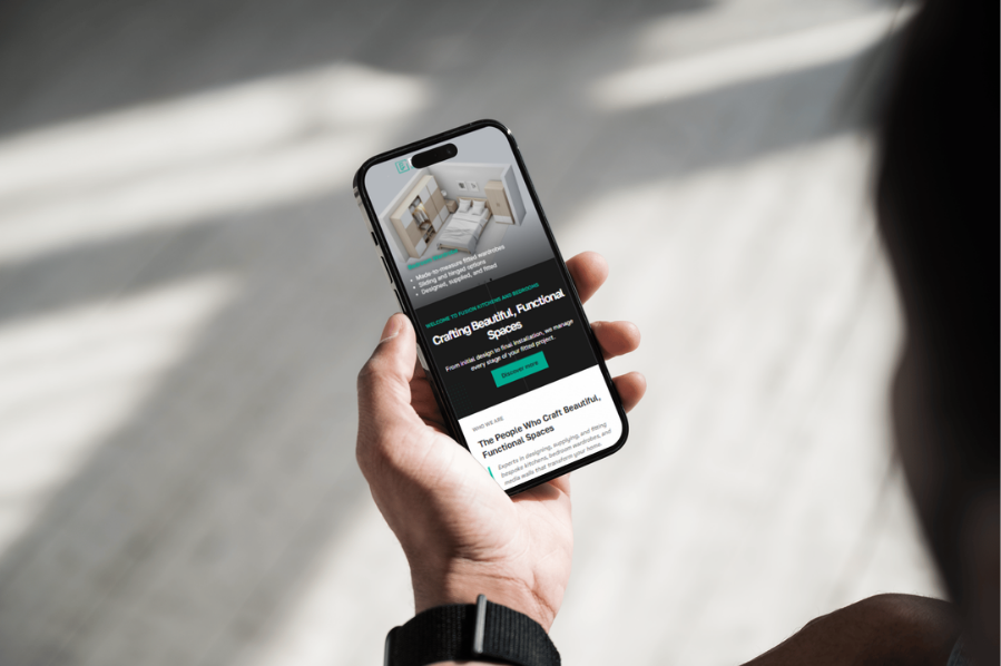
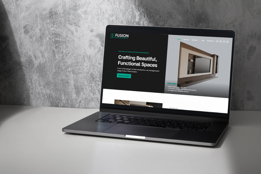
Creating a consistent brand across the logo, favicon, van graphics, business card, catalogue, and invoice template.
Fusion Kitchens & Bedrooms already had a solid service offering. What it needed was a brand presence that matched the quality of the work itself. The aim was to create a clear, trustworthy identity that felt consistent across every customer touchpoint.
We kept the branding clean and practical. The logo, favicon, van mockup, business card, catalogue, and invoice template were designed to work together without clutter, keeping the brand sharp in both print and digital formats.
The new branding gave Fusion Kitchens & Bedrooms a more professional and consistent presence. It helps the business look established, improves recognition, and strengthens the overall customer impression.
Fusion Kitchens & Bedrooms specialises in fitted kitchens, wardrobes, bedroom furniture, and media walls. The business works in a space where customers often compare style, finish, and trust before they compare price. The brand needed to reflect craftsmanship without looking overly formal. It also needed to feel flexible enough for both customer-facing materials and day-to-day business documents.
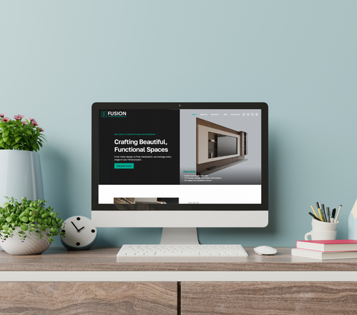
The main goal was to create a stronger identity that would carry across every part of the customer journey. The company needed branding that looked professional when first seen, then stayed consistent as the customer moved from enquiry to quote, and from quote to invoice. We also needed to make the business easier to remember.
The challenge was creating branding that felt simple but still distinctive. Too much detail would have made it look cluttered, while too little would have made it forgettable. We also had to make sure the logo and visuals stayed clear across screens, print, vehicle graphics, and small-format uses.
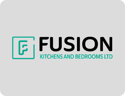
The new logo gave Fusion Kitchens & Bedrooms a sharper, more professional presence. It works well across signage, print, digital use, and branded documents without losing clarity.
A compact favicon was created to support the website and reinforce recognition in small digital spaces. It keeps the brand visible, even when only a tiny mark is available.
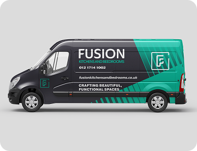
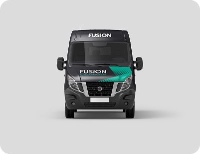
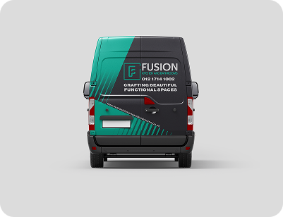
The mini van mockup turned the company vehicle into a moving brand asset. The layout was designed for visibility, with clear placement and a clean finish that suits a local service business.
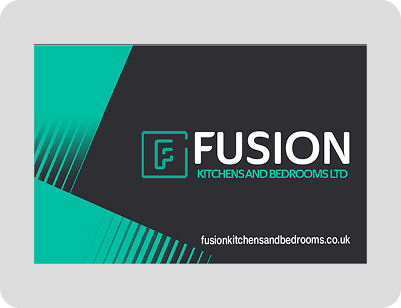
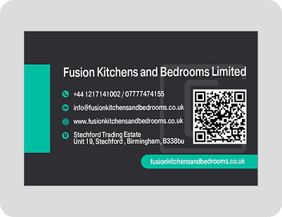
The business card gives the business a better first impression in person. It is direct, polished, and easy to read, which matters when customers are handed something they may keep for later.
The catalogue was built to showcase services in a structured way. It helps customers browse the offer without feeling overwhelmed, while keeping the branding consistent from page to page.
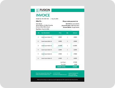
The invoice template finished the system properly. Instead of a plain document, the business now sends branded paperwork that feels considered and professional from start to finish.
WhatsApp us