

Introduction
Changing a brand that nobody notices is one thing. Changing one that people already recognise is far more complicated.
Burberry had a strong identity long before its recent rebranding efforts. Its check, trench coats and British heritage were already familiar to customers around the world. There was no obvious need to change the Brand Identity. The harder question was whether the identity people recognised still reflected the position Burberry wanted to occupy in the luxury market.
That is what makes the Burberry rebrand worth examining from a branding perspective. The company was not starting again. It was trying to adjust an established identity without throwing away the recognition it had spent decades building.
For brands operating across websites, social media, advertising and physical experiences, that problem is increasingly common. An identity has to feel current, but it also has to feel like the same brand.
Table of Contents
Why Burberry's Existing Brand Identity Needed a Rethink
Burberry did not have a recognition problem. Its check, trench coat and British heritage were already closely linked to the brand. These elements gave the company a strong foundation and helped set it apart in the luxury market. The challenge was making those familiar qualities feel relevant to changing customers.
That is where brand identity and brand perception can begin to differ. A business may see itself as modern and premium, while customers may read the same identity differently. They might see it as too traditional, less distinctive or simply out of step with current expectations.
Burberry later acknowledged that some of its brand expression had moved too far towards modernity and away from its heritage. It also found that some newer brand codes were unfamiliar to customers. This made the issue bigger than a logo or visual refresh.
Burberry had to decide what was worth keeping, what needed to change and how the brand should be understood going forward. For an established luxury brand, getting that balance wrong could affect both recognition and customer appeal.
The Risk of Changing an Established Brand Identity
Rebranding an established company is a little like renovating a familiar building. Change too little, and nobody notices. Change too much, and people may no longer recognise the place they trusted.
That tension makes Burberry’s case particularly interesting. Its identity already had meaning. Customers knew its visual cues, its heritage and what the name represented. Any major change, therefore, had to do two jobs at once: create a stronger future for the brand while maintaining enough familiarity for existing audiences.
When Familiarity Starts Working Against You
People rarely recognise a brand through its name alone. They notice colours, symbols, typefaces, products, photography and even the way campaigns are presented. Over time, these details become mental shortcuts.
That familiarity has real value. But it can also become limiting. If an identity feels too tied to an older audience or an earlier market, recognition alone will not keep it relevant. Burberry faced that tension as it tried to make its identity feel more current without losing the visual cues customers already knew.
The real question was not, “Can Burberry look different?” It was, “How different can it become before its identity starts to disappear?”
The Customer Should Not Feel Left Behind
Rebranding often focuses on winning new attention. That is only half the job. Existing customers already have an opinion about the brand. They know what they expect from it. They may associate certain colours, products or visual details with quality and trust. Remove too much at once, and those familiar connections can weaken.
This matters even more for luxury brands. Heritage is not simply background information. It can form part of the value customers attach to the brand.
Burberry therefore had to modernise without making its existing audience feel that the brand had become something completely different. That requires more than attractive design. It requires a clear understanding of what customers actually value.
Modern Does Not Mean Following Every Trend
There is another trap in rebranding: confusing modern with trendy.
Design trends move quickly. A style can look fresh this year and ordinary a few years later. Brands that follow every new visual trend risk losing their own character along the way.
Burberry had something more lasting to work with. Its British identity, outerwear heritage, Check and Equestrian Knight Design already gave it distinctive territory.
The smarter question was how those assets could work in a newer context. That is the real challenge of rebranding an established company. You are not designing from a blank page. You are deciding which parts of the existing identity deserve another chapter and which ones have reached the end of theirs.
What Burberry Changed in Its Brand Identity
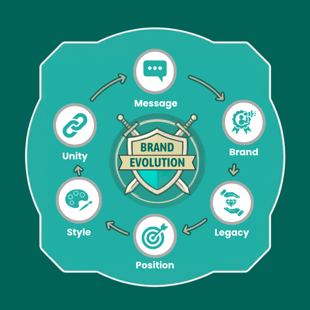
Burberry’s rebrand went beyond changing its logo. It was about shaping how people saw the brand. In 2018, the company introduced a new wordmark and Thomas Burberry monogram under Riccardo Tisci. The new direction gave Burberry a fresher look while keeping a link to its heritage.
Visual Identity
A brand’s visual identity includes more than its logo. Typography, photography, colours, packaging and layouts all influence how customers recognise and remember it. Burberry’s changes aimed to create a more contemporary feel without losing its British character. That balance matters when updating an established brand.
Brand Positioning
Design alone cannot change perception. Brand positioning gives those visual choices a clear purpose. Burberry’s recent strategy has placed greater focus on “Timeless British Luxury”, bringing its heritage and familiar brand codes back into stronger focus.
This shows why branding needs direction. A company can modernise its appearance yet weaken what makes it distinctive. The stronger approach is to connect existing strengths with a clear future position.
Brand Messaging
Brand messaging completes the picture. Website copy, campaigns, product descriptions and social content all shape how customers understand a brand. For Burberry, those messages need to support luxury while retaining its British character.
When visuals, positioning and messaging work together, the brand identity feels consistent rather than pieced together.
Why Burberry’s Rebrand Had to Go Beyond the Logo

A logo can signal change, but it cannot create it alone. Customers experience a brand through its website, campaigns, social media and product presentation. If those areas still reflect the old direction, the new identity can feel disconnected.
Making the Website Match the Brand
The website is often where customers form a stronger opinion. Its imagery, layout, wording and product presentation should support the new direction. For Burberry, the online experience needed to feel as considered as its wider luxury positioning.
Giving Social Content a Clear Identity
Social media brings another challenge. Brands compete with endless content, which can make trend chasing tempting. Burberry’s digital content needed to attract attention while remaining connected to its broader identity. The format could change, but the brand should remain recognisable.
How Digital Touchpoints Shape Brand Perception
Customers rarely experience a brand in one place. They may see a social post, search for the company and visit its website within minutes. Each interaction adds to their overall impression.
Keeping Every Channel Connected
Different channels serve different purposes. Social media can create interest, while the website provides more detail. Email can build relationships. The content can vary, but the underlying brand message should remain clear.
Turning Branding Into Experience
For Burberry, digital marketing became part of the wider brand experience. Campaigns, content and online shopping all needed to support the same direction. When those touchpoints work together, customers are more likely to understand what the brand now represents.
What Businesses Can Learn Before Rebranding
Burberry’s experience raises a useful question for other businesses: what should you actually change when your brand no longer feels right? A rebrand should begin with a clear understanding of the problem. It should also consider what already works. From there, businesses can shape a new identity that feels different without losing its sense of familiarity.
Start With the Real Problem
Before changing the design, look at the brand itself. Are customers struggling to understand what the business offers? Has the target audience changed? Does the current image feel out of step with the market? Perhaps the website and social channels present different versions of the same brand.
These questions can reveal where the real issue sits. Sometimes the answer is a new visual identity. Sometimes the business needs clearer positioning or better communication. Starting with the problem helps prevent unnecessary changes.
Know Which Brand Assets Matter
Every established brand has elements people remember. It could be a colour, symbol, product, phrase or particular style of imagery. These details may seem small, but they can carry years of recognition.
Before removing them, businesses should understand their value. Some may need updating rather than replacing. Others may no longer serve a useful purpose. The aim is not to keep everything familiar. It is to keep what still gives the brand meaning.
Listen to the People Who Buy From You
A business can become too close to its own brand. Teams see the company every day, so certain problems may become difficult to notice.
Customers can offer a different view. Their comments, reviews, searches, and reactions can reveal how the brand is truly understood. That feedback may challenge internal assumptions, but it can also reveal opportunities that a business has missed. Good rebranding starts with listening.
Make the New Identity Feel Consistent
Changing the logo is only the beginning. The new identity needs to appear naturally across the whole customer journey.
The website, social media, advertising, emails and sales materials should all feel connected. The wording can change between channels, but the brand should still sound like the same business.
This is where many rebrands lose their impact. A new design cannot carry the whole change on its own. The wider experience has to support it.
Know What Success Looks Like
A rebrand should have a clear goal before it begins. More awareness might be the aim. Better audience engagement could matter more. Some businesses may want stronger website performance, more enquiries or improved customer perception.
The right measures depend on the problem being solved. There is no single number that proves a rebrand worked.
What matters is having something meaningful to compare. That makes it easier to see whether the new direction is actually changing how people respond to the brand.
Conclusion
Burberry’s rebrand shows that a brand identity needs a clear purpose. A fresh logo alone will not change how people see a business. The wider experience matters too, from the website and social media to campaigns and customer interactions. When those elements feel disconnected, the brand can lose its impact.
That lesson applies to businesses beyond luxury fashion. Midland Marketing can help businesses consider branding as part of their broader digital presence, rather than treating it as a separate design task. A strong identity should carry through the channels where customers discover, compare and engage with a business.
Before starting a rebrand, businesses should first ask what customers think today and what needs to change. Those answers can shape the visual identity, messaging and digital experience. When everything works towards the same idea, a rebrand becomes more than a new look. It gives the business a clearer presence and a stronger connection with its audience.
Frequently Asked Questions
Why is rebranding risky for an established business?
People already know an established brand. They have certain ideas about it too. Change too much, and those familiar links can fade. Change too little, and the rebrand may barely register. The challenge is knowing where that line sits.
What should you check before starting a rebrand?
Look at how people see the brand now. Are they connecting with it? Does it still suit the audience? Does the website match the image you want to create? These answers can show whether the problem is really the design or something deeper.
Does every part of a brand identity need to change?
Not necessarily. Some parts may still work well. A colour, symbol, typeface or visual style might already be familiar to customers. Before removing anything, it is worth asking what value it still brings. Some elements may need a refresh rather than a complete replacement.
How does rebranding affect digital marketing?
A new identity has to work online too. Customers may first see the brand on social media, then visit the website or find an advert through search. If each channel feels different, the new direction can become unclear. The digital experience should feel connected.
How can a business tell if its rebrand is working?
Give it time and look at the right signs. Customer feedback can help. So can website activity, enquiries, engagement and brand searches. The useful measures depend on what the business wanted to change in the first place.
Is changing the logo enough?
No. The logo is only one part of the change. Customers also notice the website, messaging, imagery, content and social media. If those areas still feel like the old brand, the new logo will only tell part of the story.

Written by - Lauren Davison
Introducing Lauren – one of our content writers who has a flair for SEO and creative strategy!
With a Master’s Degree in Creative Writing, Lauren has niched down into SEO and content writing.
Outside of work, she loves watching the darts, reading and the pub on the weekend.
Want some more?
Latest Insights & News

Lead Generation Website Tips for Better Conversions and Privacy
Introduction A good website should do more than look nice. It should bring in the right people, show them what you offer and make it

The 3D Revolution: How Piccadilly Lights Is Transforming Ecommerce Web Design
Introduction Have you walked through London lately? If so, you probably saw the massive Piccadilly Lights screen. Big shoes look like they jump right off

The Risky Burberry Rebrand: Why Its Brand Identity Had to Change
Introduction Changing a brand that nobody notices is one thing. Changing one that people already recognise is far more complicated. Burberry had a strong identity