

Introduction
Minimalist logos are not disappearing in 2026, but they are losing their edge. For years, brands used clean fonts, simple shapes and muted colours to look modern. The problem? Many started to look alike.
Current logo design trends in 2026 show a move towards bolder type, stronger colours and more character. This shift is part of wider branding trends in 2026, where brands want to stand apart rather than blend in.
The message is clear: minimalism still has a place, but generic minimalist logos are finding it harder to make a lasting impression.
Table of Contents
Why Did Minimalist Logos Become So Popular?
Minimalist logo design became popular because it worked in a digital-first world. Simple shapes and clear type stayed easy to read on small screens.
They fit favicons, social media icons and mobile apps. A clean visual identity could scale across signs, websites and phones without losing its form.
The Digital-First Design Advantage
The rise of digital interfaces made simple logo design practical. Responsive logos could shrink without becoming hard to read. Fewer details meant faster recognition and easier use across many brand touchpoints.
When Simplicity Became a Formula
The problem came when brands used the same approach. Similar fonts, soft colours and simple marks began to repeat. What once helped a brand stand out could make it blend in. Minimalism still works, but visual identity needs its own character.
Is Minimalism Actually Dying Or Is Blanding The Real Problem?
Minimalist logos are not the problem on their own. The bigger issue is blandness: when brands use the same safe design choices and start to look alike.
Design Week links this trend to brands built around neutral type, simple systems and digital scalability, while D&AD’s 2026 coverage points to growing interest in louder, more expressive identities.
What Is Blanding?
Blanding happens when brands become visually similar by using the same design rules. Simple does not always mean bland. A clear identity can still feel bold, ownable and memorable
How Brands Start Looking The Same
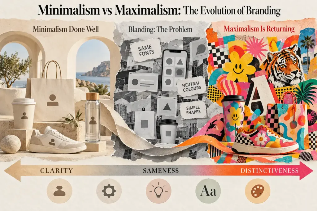
The pattern is easy to spot: geometric sans-serif fonts, neutral colours, flat symbols, rounded shapes and little visual detail. When too many brands follow this formula, brand differentiation becomes harder.
The goal is not to add detail for the sake of it. It is to give a brand something people can remember.
Why Maximalist Branding Is Returning In 2026
Maximalist branding is gaining ground in 2026 as brands look to stand apart. The shift is less about making logos loud and more about breaking away from sameness. Current logo design trends in 2026 show bold type, unusual shapes, colour and detail.
The Need For Differentiation
When many brands use the same clean look, being noticed gets harder. A stronger point of view can help a brand feel more unique and human.
Human Character In The Age Of AI
AI can make polished design fast. That makes human touches, custom work and a story more valuable. Designers are responding with work that feels made for a brand, not a template.
More Expressive Brand Systems
The change goes beyond the logo. Brands are using bold typography, colour, motion, illustration and fresh layouts to build a stronger visual identity.
What Do Maximalist Logo Design Trends in 2026 Look Like?
A maximalist logo uses bold visual choices to give a brand more character. It may use bright colour, custom type, texture, rich detail or unusual shapes. Unlike a plain mark, it aims to feel more expressive and easier to remember.
Bold And Expressive Typography
Type can become part of the logo’s main visual idea. Custom typography, large letterforms and playful shapes can give a brand a look of its own.
Stronger Colour And Contrast
Brands are using brighter colours and richer palettes. Strong contrast can help key elements stand out. Gradients can also add depth when they have a clear role.
Texture, Illustration And Imperfection
Clean lines are making room for texture, handmade details, rough edges and organic forms. Illustration can add warmth and help a logo feel less like a ready-made template.
Movement And Adaptive Identities
A brand may no longer rely on one fixed mark. Flexible logos can change across screens, platforms and motion, while still keeping the same core identity. This wider shift is part of current 2026 identity design.
Minimalist Vs Maximalist Logos: Which Approach Fits A Brand?
There is no single right choice in the minimalist vs maximalist logos debate. The right style depends on your brand strategy, audience and visual identity. A logo should support your brand personality, not follow a trend just because it is popular.
Minimalist | Maximalist |
Simple | Expressive |
Restrained | Layered |
Flexible | Character-rich |
Low visual noise | High visual presence |
Often system-led | Often personality-led |
Minimalism May Suit Brands That Need
Minimalist logo design can help brands that value clear messages, fast recognition and easy use across digital spaces. It can also suit a calm or refined brand position.
Maximalism May Suit Brands That Need
Maximalist branding can suit brands that want more personality, energy and visual impact. Rich colour, custom type and bold details can help build stronger recognition.
The Middle Ground: Distinctive Simplicity
The goal is not more detail. It is more distinctiveness with the right level of simplicity. A strong visual identity should be easy to use, but still feel like it belongs to one brand.
What Should Businesses Do If Their Logo Looks Outdated?
A business should review its logo when it no longer fits the brand, feels too close to rival brands or works poorly across today’s digital and print spaces. A clear review can show whether the logo needs a small refresh or a full rebrand.
Signs Your Logo Needs Reviewing
Look for signs such as a logo that looks like many others, no longer reflects the business, or becomes hard to use on websites, social profiles or other brand touchpoints. An uneven visual identity can also make the brand feel less clear.
Don't Redesign Just To Follow A Trend
The latest logo redesign trends 2026 should inform a decision, not make it. Changing a logo just because maximalist branding is popular can create a weak fit. Start with the brand, audience and goals. Midland Marketing’s rebranding services can support a more planned approach.
The Future Of Logo Design Is Distinctiveness
The real shift in logo design trends in 2026 is not from minimalism to maximalism. It is towards stronger brand differentiation. A good identity should reflect the brand, stand apart and work across every channel.
That means clear strategy, distinctive design, flexible brand systems and a consistent look. Minimal or bold, the goal is the same: build a brand people can recognise and remember.
Frequently Asked Questions
- Are minimalist logos outdated?
No. Minimalist logos still work well when clarity and ease of use matter. The issue is generic design. If a logo looks like many others, it may need a stronger visual idea to improve brand recognition and differentiation.
- What is maximalist branding?
Maximalist branding uses bold type, rich colour, texture, illustration and strong visual details. It gives a brand more personality and presence. The aim is not to add detail for its own sake, but to create a more distinctive identity.
- Why do so Many logos look the same?
Many brands follow similar design rules, such as clean fonts, neutral colours, simple shapes and flat symbols. This can lead to blending, where brands lose visual character and become harder to tell apart.
- Should my business choose a minimalist or maximalist logo?
Start with your brand strategy, audience, market and personality. Consider where the logo will appear and how it needs to work. Choose the style that helps your business stand out while staying clear and useful.
- When should a business redesign its logo?
Consider a redesign when your logo no longer reflects the business, looks too similar to competitors or works poorly across key channels. A review can show whether you need a small refresh or a wider rebrand.
Written by - Lauren Davison
Introducing Lauren – one of our content writers who has a flair for SEO and creative strategy!
With a Master’s Degree in Creative Writing, Lauren has niched down into SEO and content writing.
Outside of work, she loves watching the darts, reading and the pub on the weekend.