


Introduction
UK service providers face growing pressure to generate more leads without continually increasing their marketing spend. Although a website may attract visitors, that traffic does not always result in enquiries, phone calls or quote requests.
A single-page website can help address this challenge by bringing essential business information into one clear journey. Services, customer benefits, testimonials, FAQs and calls to action can work together to help visitors understand the offer and decide what to do next.
However, placing everything on one page is not enough. The content must answer customer questions, build trust and make the next step clear. With the right structure and messaging, businesses can improve the chances of turning existing traffic into enquiries and make better use of their marketing budget.
Table of Contents
Why Are UK Service Providers Rethinking Website Structure?
Traditional websites often spread important information across multiple pages.
A visitor might need to:
- Read the homepage.
- Find the services page.
- Open a specific service.
- Look for pricing information.
- Search for testimonials.
- Find contact details.
- Complete an enquiry form.
Every additional step creates another opportunity for the visitor to leave. This does not mean multi-page websites are ineffective. They can work extremely well for larger companies with complex services and broad search strategies.
The problem starts when a simple service journey becomes unnecessarily complicated.
For a plumber, consultant, cleaning company, marketing agency or professional contractor, the visitor may only need a few answers:
- What do you offer?
- Can you solve my problem?
- Can I trust you?
- What should I do next?
A focused website structure can answer those questions without making the visitor hunt for them.
What Makes a Website Layout High-Converting?
A high-converting layout needs more than attractive design. Its strength comes from guiding visitors through a clear journey.
Each section should answer a specific question or address a potential concern. The page should then guide visitors naturally towards making an enquiry.
A strong structure could include:
1. A clear opening message
The first screen should immediately explain what the business does and who it helps.
Avoid vague statements such as:
Digital solutions for modern businesses.
A stronger approach identifies the service and outcome.
For example:
Conversion-focused websites for UK service businesses.
The visitor should understand the offer without scrolling.
2. A focused value proposition
The next section should explain why the service deserves consideration.
This is where businesses can introduce practical benefits rather than simply listing features.
Think about:
- Faster response times
- Better customer experience
- More qualified enquiries
- Specialist expertise
- Local knowledge
- Flexible service options
The benefits should relate directly to what the customer wants.
3. Services presented around customer needs
A service provider does not need to explain everything at once.
Instead, group services into clear sections.
Each service can briefly explain:
What it is → Who needs it → What problem it solves.
This keeps the page useful without turning it into a wall of text.
4. Trust signals at the right moments
Trust should not be left until the bottom of the page. Reviews, client logos, accreditations, case studies and results can appear throughout the journey.
A visitor who has just discovered a company may need reassurance before continuing.
5. Strong calls to action
A high-converting page should not force visitors to search for the next step.
Use clear CTAs such as:
- Request a quote
- Book a consultation
- Speak to our team
- Get started today
The CTA should also match the visitor’s stage in the decision-making process.
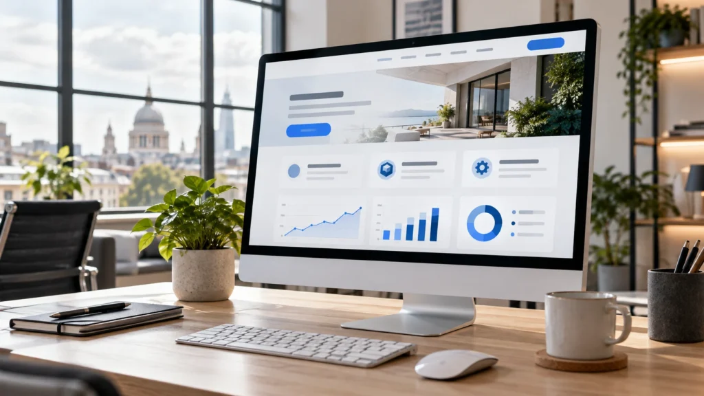
How Single-Page Website Design Can Reduce Acquisition Costs
Acquisition costs depend on more than advertising spend. If a company attracts 1,000 visitors but only a few enquire, the cost of generating each lead can become expensive.
Improving the website can help change that. Imagine a business receives 1,000 relevant visitors.
If 2% become enquiries, that produces 20 leads. If the same traffic generates a 4% conversion rate, the business receives 40 leads.
The traffic has not increased. The advertising budget has not increased. The website has simply become more effective at converting existing demand.
A focused website layout can therefore support a wider customer acquisition strategy rather than serving as a purely design-led decision.
However, businesses should not assume that a simpler layout will automatically produce better results. Conversions depend on the audience, offer, traffic source, messaging, page speed, trust signals and overall user experience.
The Conversion Journey Should Feel Intentional
A common mistake is designing a page section by section without considering the overall journey.
A better approach is to think about the visitor’s decision-making process. A service page could follow this sequence:
Problem → Solution → Benefits → Proof → Process → Objections → CTA
This creates a logical flow.
The visitor first recognises the problem. The business then introduces its solution. Benefits explain the value. Proof builds confidence. The process removes uncertainty.
FAQs can address remaining concerns. The CTA then provides a clear next step.
This approach makes the page feel less like a brochure and more like a guided sales conversation.
What Should You Include on a Single-Page Service Website?
The exact structure should depend on the service. However, many UK service providers can benefit from including the following:
- Hero section: Explain the service and its primary benefit immediately.
- Customer problem: Show that you understand the issue the customer is trying to solve.
- Service solution: Explain what the company provides.
- Benefits: Focus on outcomes rather than technical features.
- Social proof: Use reviews, testimonials, case studies or recognisable client evidence.
- How it works: Give visitors a simple explanation of what happens after they enquire.
- Supporting evidence: Include accreditations, experience, statistics or relevant results.
- FAQs: Answer questions that may prevent someone from making contact.
- Final CTA: End with a clear and specific action.
This structure can be adapted for accountants, consultants, tradespeople, agencies, healthcare providers, professional services and many other sectors.
Why Above-the-Fold Design Still Matters
The first section of a website has an important job. It needs to create enough clarity for the visitor to decide whether the page is worth exploring.
This does not mean every piece of information needs to appear above the fold.
Instead, visitors should quickly understand:
- What the company offers
- Who it serves
- Why it may be relevant
- What they can do next
Strong above-the-fold design reduces uncertainty. It also creates a natural reason to continue scrolling.
The mistake is trying to place every selling point into the first screen. Too much information can have the opposite effect. Good design creates hierarchy.
Mobile-First Design Is Essential for Service Businesses
A single-page layout must work particularly well on mobile devices. Long pages can become difficult to navigate when poorly designed for smaller screens. Buttons may become difficult to tap. Forms may feel excessive.
Paragraphs may become too long. Important information may become buried beneath unnecessary elements. Google also recommends responsive design as a way to make websites work across different devices.
For service businesses, mobile optimisation is particularly important because many visitors may discover a company while searching on their phones.
The page should therefore be tested for:
- Readability
- Button placement
- Form usability
- Navigation
- Loading speed
- Image sizing
- Spacing
- Content hierarchy
A page that looks excellent on desktop can still perform poorly on mobile.
SEO and Conversion Should Work Together
A high-converting page should not ignore organic search. SEO brings relevant visitors to the website. Conversion-focused design helps turn those visitors into enquiries. The two should support each other.
For example, a UK marketing agency might target searches around:
- Web design services
- SEO services
- Digital marketing services
- Website design for small businesses
The page can then address the searcher’s intent while guiding them towards an enquiry. Businesses can also use tools such as Semrush to research search demand, competitor visibility and keyword opportunities.
However, keyword placement should remain natural. A page written purely for search engines can quickly become difficult to read. Search visibility matters, but so does what happens after the visitor arrives.
Single-Page Website vs Multi-Page Website: Which Is Better?
There is no universal winner. The right choice depends on the business.
Single-page approach | Multi-page approach |
Simple service offering | Complex service portfolio |
Short decision journey | Multiple customer journeys |
Focused campaign | Large SEO strategy |
Clear conversion goal | Many search intents |
Limited content requirements | Extensive resources |
Strong landing-page focus | Multiple service locations |
A single-page website can work particularly well when the business has one core offer or wants to create a highly focused customer journey.
A multi-page website may be better when the business needs individual service pages, location pages, resources and detailed information. In some cases, the strongest strategy combines both.
Common Single-Page Design Mistakes
A single page can become ineffective when everything is simply placed together.
- Too much information: Long does not automatically mean useful. Every section should earn its place.
- Weak calls to action: A visitor should never wonder what to do next.
- Generic messaging: Statements such as “quality you can trust” provide little evidence. Specific claims are more persuasive.
- Poor content hierarchy: If every heading looks equally important, visitors struggle to scan the page.
- Repeating the same message: Repetition creates length without adding value. Each section should move the conversation forward.
- Ignoring page speed: Heavy images, unnecessary scripts and poorly optimised assets can create a frustrating experience.
- Treating mobile as an afterthought: Consider mobile design from the beginning, not as an afterthought.
How UK Service Providers Can Build a Better Conversion-Focused Layout
The best starting point is not the design software. It is the customer. Before creating the layout, identify:
- Who is visiting?
- What problem brought them here?
- What information do they need?
- What objections could stop them enquiring?
- What evidence can build trust?
- What action should they take?
The answers can then shape the page. This approach also makes content creation easier because every section has a defined purpose.
Instead of asking, “What should we put on the homepage?”, ask:
“What does the visitor need to know before they contact us?”
That question usually produces a much stronger website.
How Midland Marketing Can Help Build a Conversion-Focused Website
A high-performing website needs more than a modern appearance. It needs clear messaging, logical structure, responsive design and a strong understanding of how customers make decisions online.
Midland Marketing can help businesses develop websites around these principles, combining design, content and digital strategy to create a clearer path from visitor to enquiry.
If your current website attracts traffic but generates too few enquiries, it may be time to review the journey rather than simply increase your marketing budget. Contact Midland Marketing to discuss your website requirements.
You can also explore Midland Marketing’s web design services to see how a more conversion-focused approach can support your business.
Conclusion
A website does not need dozens of pages to generate meaningful enquiries. For the right business, a carefully planned single-page website can create a more direct customer journey. It can bring the offer, benefits, proof and CTA into one connected experience.
But the real advantage is not the number of pages. It is the thinking behind them.
When every section answers a customer question, and every CTA has a purpose, the website becomes more than an online brochure. It becomes part of the acquisition process.
For UK service providers looking to get more value from existing traffic, that shift can be worth exploring before simply spending more money on advertising. Contact Midland Marketing to discuss a conversion-focused website strategy.
Frequently Asked Questions
Can a one-page site rank on Google?
Yes. A one-page site can rank on Google when its content matches search intent, provides useful information and follows sound technical SEO practices. Businesses targeting several services or locations may need separate pages to address different search queries effectively.
What should a service business include on its website to generate more enquiries?
A service business should include a clear headline, service details, customer benefits, testimonials, trust signals, frequently asked questions and visible calls to action. The content should address customer concerns and make it easy to request a quote or contact the team.
Is a one-page layout suitable for every UK service business?
No. This structure can suit businesses with one main service, a focused audience or a straightforward sales journey. Companies offering multiple services across different UK locations may benefit from dedicated pages that provide relevant information for each audience.
Can a focused website layout help reduce customer acquisition costs?
Yes, it can help by making existing website traffic more likely to convert into enquiries. Clear messaging, relevant proof and simple navigation can support this goal. However, results also depend on traffic quality, advertising costs, the strength of the offer and the user experience.
How can I improve my website conversion rate?
Start by reviewing your headlines, service information, calls to action, contact forms, mobile usability and page loading speed. Use website analytics to identify where visitors leave, then test changes to see which improvements generate more enquiries.