


Introduction
The DTC websites do more than sell. They help people find products, understand them, trust the brand and buy with less effort. That matters in UK ecommerce, where sales made up 28.8% of retail sales in August 2026, according to the Office for National Statistics.
We look at ecommerce website examples from High-Growth UK Direct-to-Consumer and break down their ecommerce user experience, from navigation and product discovery to mobile use and checkout. The aim is to show what makes an online store easier to use and easier to buy from.
Table of Contents
What Makes A DTC Website Feel Seamless?
A seamless DTC website helps shoppers find what they need, understand their choices, trust the brand and buy without needless steps. A strong ecommerce user experience should feel simple from the first click to checkout.
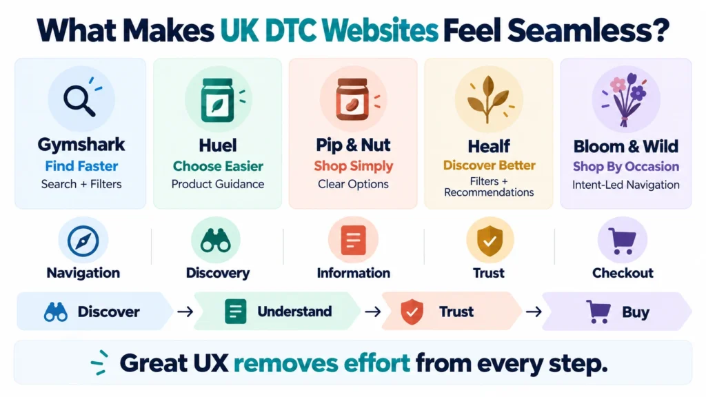
Five UX signals show whether a site works well: clear website navigation, quick product discovery, useful product information, strong trust signals and a smooth checkout experience. These basics shape how easily a visitor moves from interest to purchase. The best ecommerce UX examples make each step clear, useful and easy to follow.
How We Chose These UK DTC Brands
We picked these high-growth DTC brands using three checks: strong UK relevance, clear evidence of growth and a notable ecommerce user experience. These DTC brand examples are judged on what their websites do well, not on claims that UX alone drove growth. Together, they offer useful ecommerce website examples for brands looking to improve their own sites.
Gymshark: Turning A Large Catalogue Into A Clear Shopping Journey
Gymshark shows how a large fitness apparel range can still feel easy to shop. The UK DTC brand keeps its ecommerce navigation focused, helping visitors move from broad categories to the products they want. Search and filters then reduce the effort of comparing a busy catalogue.
What Gymshark Gets Right
The Gymshark ecommerce website uses clear categories, search, filters and strong product imagery to support product discovery. Its shopping journey also keeps the route towards checkout simple. Shopify highlights Gymshark as an example of category filters, search and a single-page checkout.
The Lesson For Growing Brands
A bigger catalogue does not need a harder customer journey. Clear UX helps shoppers narrow their choices without losing their way.
Huel: Making Product Education Part Of The Buying Journey
Huel faces a different challenge from fashion brands. Shoppers may need to learn what a product does, how to use it and which option fits their needs. The site brings this product education into the buying journey, rather than making customers search for answers.
What Huel Gets Right
The Huel ecommerce website puts product details, benefits, nutrition, FAQs and subscription choices close to the buying decision. Its homepage guides shoppers by goals, while its product pages explain benefits and ingredients. Omnisend highlights Huel for its clear information, guided choice and flexible subscription options.
The Lesson For Growing Brands
The better approach is to break complexity into clear steps. It breaks information into clear steps, helping shoppers choose with less guesswork.
Pip & Nut: Simplifying A Growing Ecommerce Catalogue
Pip & Nut shows how a growing product range can stay simple to shop. Its site needs to handle different flavours, sizes and buying options without making shoppers work harder.
From More Products To Easier Choices
The Pip & Nut website uses mobile-first layouts, clear product options and useful details on each product page. Shoppers can choose flavours and sizes, read reviews, build bundles and select subscriptions. Live cart messages also help make the next step clear.
The Lesson For Growing Brands
Adding more products can quickly make an ecommerce site harder to use. Pip & Nut shows that clear choices, simple product pages and helpful buying tools can keep the journey smooth as a catalogue grows.
Healf: Solving Choice Overload With Better Product Discovery
Healf tackles a harder ecommerce problem: helping shoppers choose from thousands of wellness products without feeling lost. The UK DTC brand offers more than 5,000 products across 400+ brands, making product discovery central to its site.
The UX Challenge
The Healf ecommerce website uses clear categories, filters and curated routes to narrow searches. Its quiz and AI guide add personalised ecommerce support, helping users compare options and find products that fit their needs. Healf highlights these tools on its own site.
The Lesson For Growing Brands
More products can mean more choice, but also more doubt. Strong ecommerce UX examples show how clear categories, useful filters and guided recommendations can reduce that load. Healf turns product discovery from a search task into a guided journey.
Bloom & Wild: Designing Around Why Customers Buy
This shows how a DTC website can start with the reason for a purchase, not just the product. Customers can shop by occasions such as birthdays, thank-yous, weddings and new baby gifts, making discovery more natural.
From Product Categories To Buying Reasons
The Bloom & Wild website groups products around gifting moments, while curated collections help shoppers narrow their search. Its site blends flowers, plants, food, cards and other gifts, giving customers more ways to meet the same need. Reviews and delivery details also add reassurance.
The Lesson For Growing Brands
Good ecommerce navigation should match customer intent. When a site reflects why someone is shopping, product discovery feels easier and the path to purchase becomes clearer.
What These High-Growth UK Direct-to-Consumer Brands Have In Common
The strongest UK DTC websites do not rely on looks alone. They make each step easy to follow through checkout.
They Design For Decisions, Not Just Browsing
Good ecommerce UX helps shoppers answer four questions: What is this? Is it right for me? Can I trust it? What should I do next? Clear product pages, filters and trust signals answer those questions at the right point.
They Reduce Friction Where It Matters
The strongest UK DTC websites do more than look good. They help shoppers make decisions at every stage. Each step removes a barrier before shoppers move on.
They Make Brand And UX Work Together
Strong branding should support clarity, not compete with it. Omnisend highlights intent-led navigation, product pages that remove doubt and consistent experiences across devices as traits of strong ecommerce sites.
What Can Other Ecommerce Brands Learn From These Examples?
Strong ecommerce web design should make each step easier, from first visit to checkout. A well-planned shopping journey keeps the next step obvious.
Start With The Customer Journey
Map the path from landing page to category, product, basket and checkout. Find where users drop off.
Remove The Biggest Buying Doubt
Answer questions about price, delivery, returns or quality near the product to reduce hesitation. Clear answers can improve website conversion.
Make Mobile A Core Experience
Keep menus, buttons, images and checkout easy to use on smaller screens. Test the mobile ecommerce journey.
Measure Before Calling A Design Better
Track conversion rate, add-to-cart rate, checkout completion and mobile performance. Let data guide ecommerce conversion optimisation.
Conclusion
The High-Growth UK Direct-to-Consumer websites do not win by adding more features. They remove needless effort. Their ecommerce UX helps people find, trust and buy with ease. For brands planning their next ecommerce web design project, these examples show how clear journeys and conversion-focused design can turn a good website into a better one.
Frequently Asked Questions
What Makes A Good DTC Ecommerce Website?
A good DTC ecommerce website has clear navigation, useful product information, strong trust signals and a simple checkout that helps shoppers buy with ease.
What Are The Best UK DTC Website Examples?
Gymshark, Huel, Pip & Nut, Healf and Bloom & Wild show how UK DTC brands can use clear design and smart UX to improve online shopping.
What Is Ecommerce UX?
Ecommerce UX is how easily people can browse products, understand their choices, trust a brand and complete a purchase online.
How Can Ecommerce UX Improve Conversions?
Clear navigation, useful product details, trust signals and an easy checkout can remove barriers and create a smoother path to conversion.
What Should I Look For When Reviewing An Ecommerce Website?
Check five areas: navigation, product discovery, product information, trust and checkout. These show whether an ecommerce website makes buying easy.