


Introduction
Minimalism and maximalism are both influencing London brand identities in 2026. Neither is the clear winner. A minimalist identity can make a business feel focused and easy to understand. Maximalist design can give a brand more character and make it harder to overlook.
The current corporate identity trends landscape is not about making every brand look the same. Businesses are taking different routes based on their audience, positioning and personality.
That distinction matters. A financial brand may need visual restraint, while a creative business may have more room for colour, unusual typography and expressive imagery. Neither choice is automatically better.
The real decision is simpler: what should the identity make people notice, understand and remember?
Table of Contents
How Minimalist Corporate Branding Creates Clarity in 2026
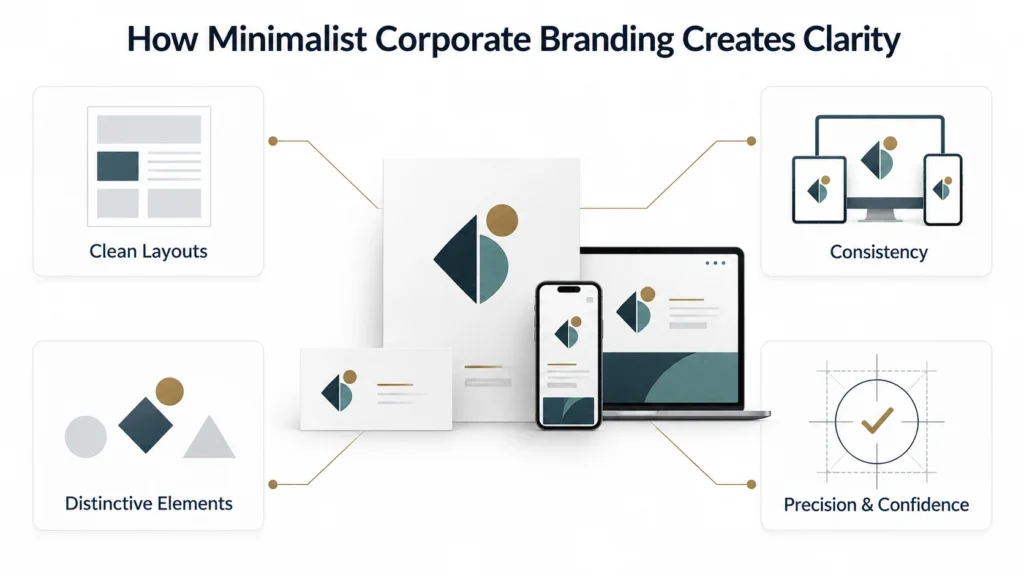
Clean layouts, sharper recognition
Minimalist corporate branding uses fewer visual elements to make the important ones stand out. Clean layouts, considered spacing and controlled typography can make information easier to process.
This is useful for brands that need a straightforward visual presence. A simple design can also make key assets easier to recognise across different channels. There is a limit, though. Removing detail does not automatically create a strong identity.
Why simplicity strengthens consistency
A restrained visual system can be easier to manage across different brand materials. The same typefaces, colours and layout rules can be adapted for a website, presentation, social post or printed document.
Teams have fewer design decisions to make from one asset to the next. That consistency can help a brand feel established. It also reduces the risk of every marketing asset looking like it came from a different business.
When minimalism starts looking generic
Minimalism can lose its impact when too many brands make similar choices. Neutral colours, familiar sans-serif fonts and large areas of empty space are easy to use. They are also easy to copy.
Without something distinctive, a clean identity can become difficult to tell apart from its competitors. The answer is not to add decoration for the sake of it. One or two recognisable elements may do more for the brand than ten extra design features.
The minimalist signal
A restrained identity can suggest precision, confidence and control. That makes it useful for brands where clarity is part of the customer experience.
But minimal does not have to mean plain. A distinctive typeface, carefully chosen colour or unusual layout can give a simple identity plenty of character.
Why Maximalist Branding Is Gaining Ground Among London Brands
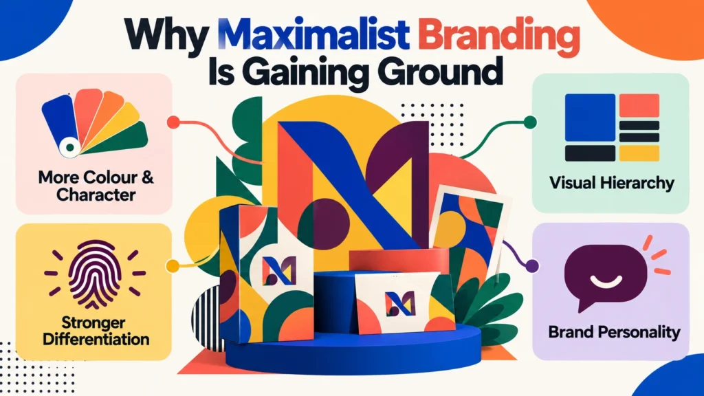
More colour, more character
Maximalist branding takes a more expressive approach to colour, type, imagery and graphic design detail. Instead of making visual elements quieter, it gives them a more prominent role.
That can create an identity with a stronger personality. It also gives brands more freedom when developing campaigns, social content and other visual communications.
More does not always mean better. The individual elements still need to work together.
Maximalism as a differentiation tool
A bold identity can help a business stand apart in a category where competitors look similar. Strong colour combinations or distinctive typography can become recognisable brand assets.
They can also make a business feel more confident in its creative point of view. The important distinction is between recognisable boldness and visual noise. A busy design with no clear idea behind it will not necessarily help a brand stand out.
When bold becomes overwhelming
Maximalist design needs discipline. If every element competes for attention, the viewer has nowhere to look first.
Important information can disappear among patterns, colours, imagery and typography. A visual hierarchy solves much of this. Even an expressive identity needs a clear order of importance.
The personality advantage
Maximalism can suit brands that want their visual identity to feel energetic, creative or unconventional. It can also give a brand more scope for self-expression.
Campaigns can use different combinations of colour, imagery and type while still working within the same overall identity. That flexibility is useful, but only when the underlying brand remains recognisable.
London Branding Trends: Minimalism vs Maximalism in Practice
Where each approach works best
There is no industry rule that says a particular sector must use minimalism or maximalism. A business focused on precision and clarity may lean towards a restrained identity.
A brand built around creativity or cultural expression may have more reason to use a richer visual language. Audience expectations matter too. What feels appropriately bold to one group may feel excessive to another.
Visual identity at a glance
Brand Consideration | Minimalism | Maximalism |
Visual complexity | Low | High |
Brand personality | Restrained | Expressive |
Colour use | Limited | Layered or contrasting |
Typography | Clean and controlled | Experimental or prominent |
Recognition | Distinctive simplicity | Distinctive visual expression |
Best suited to | Clarity-led brands | Personality-led brands |
What London brands need to consider
London is a competitive market. A brand needs to be recognisable without making the design harder to use. That balance is important. A distinctive identity should still work on a website header, mobile screen, presentation or social post.
A visually impressive concept means little if it falls apart when applied in real situations. The city itself does not dictate the design choice. The business does.
Why copying either style can backfire
Following a popular design direction can make a brand look current. It does not necessarily make it memorable.
A business should first decide what it wants its identity to communicate. The visual direction can then support that decision.
Copying another brand’s aesthetic often creates a surface-level similarity without the thinking behind it.
Which Corporate Identity Trends Are Shaping Brand Differentiation?
Distinctive visual identity
A recognisable visual identity involves more than a logo. Colour, typography, imagery, composition and other recurring elements can all contribute to recognition.
When these pieces work together, people can begin to associate the visual style with the business itself. This is particularly useful in digital spaces where the logo may be small or absent.
Personality over decoration
Design should give the brand a recognisable character. A business does not become more creative simply because its identity contains more shapes or colours.
Likewise, removing visual detail does not automatically make it more sophisticated. The better question is whether each design choice says something about the brand
Flexible design systems
Design systems give brands a practical way to stay consistent while producing different types of content. A system can define how colours, typefaces, layouts and imagery are used.
You can then adapt it for different platforms without starting from scratch each time. That matters as brands move between websites, social media, digital advertising and physical materials.
Recognition beyond the logo
A strong identity should remain recognisable even when the logo is not the main feature. A distinctive colour treatment, type style or image direction can provide useful recognition cues.
Over time, these elements can become strongly associated with the brand. This is one reason visual consistency matters beyond individual marketing assets.
How London Branding Trends Are Changing Digital-First Identity Systems
Designing for smaller screens
A digital identity needs to survive at small sizes. Details that look impressive on a large desktop layout may disappear on a phone.
Fine typography can become difficult to read. Complex graphics may lose their impact. Designers therefore need to consider how the identity behaves before it is reduced to a small screen.
Motion enters the identity
Motion is becoming another way for digital brands to express personality. Simple animation can draw attention to an important element or make an interface feel more distinctive. It can also be used in social content and digital campaigns.
There is no need to animate everything. Movement should have a clear role rather than becoming another source of distraction.
Consistency across digital touchpoints
A brand should feel connected across its digital channels. A website can have a different layout from an email or social post. The underlying colours, typography, imagery and visual principles should still create a recognisable link.
Consistency does not mean repetition. It means maintaining the same identity while allowing each format to work properly.
Building for long-term flexibility
Digital channels change quickly. A brand identity needs enough flexibility to accommodate new formats without losing its core character. A rigid system can make new content difficult to produce.
An overly loose system can make the brand feel inconsistent. The useful middle ground is a clear set of rules with enough room for practical adaptation.
How to Choose Between Minimalism and Maximalism for a London Brand
Start with brand personality
Start with what the brand needs to communicate. If precision, calm and clarity are central to the proposition, a restrained identity may make more sense.
If energy, creativity or self-expression matter more, a bolder approach may be appropriate. The design should reflect the personality rather than create one artificially.
Match the audience, not the trend
A design trend should never be the main reason for changing a corporate identity. Consider how the target audience views the category. Look at what competitors are doing.
Then identify where the brand can be distinctive without becoming difficult to understand. A style that looks impressive to a design team may not have the same effect on customers.
Test recognition before launch
Put the proposed identity into realistic situations before committing to it. Try the design on a website page, mobile screen, social post and presentation.
Look at it both with and without the logo. If the visual elements still feel connected, the identity has a stronger foundation.
Build a style with staying power
An identity should not depend entirely on a 2026 design trend. Trends can influence the work without controlling it.
A business needs a visual foundation that can remain useful as campaigns, platforms and customer expectations change. That makes the identity easier to manage in the long term.
What These Design Shifts Mean for London Brands in 2026
Neither minimalism nor maximalism is universally better. The right choice depends on what the business needs its identity to achieve.
The wider corporate identity trends shaping 2026 show a move towards more deliberate visual choices. Some brands are stripping back their identities to improve clarity. Others are using stronger visual expression to create distinction.
For London businesses, the decision should come back to positioning, audience and personality. A restrained identity can be distinctive when it has a clear idea behind it. A bold identity can work just as well when its visual choices are controlled.
Midland Marketing places emphasis on simplicity, transparency and authenticity. That approach supports the idea that good branding does not need unnecessary complexity to make an impression. pasted
The objective is straightforward: create an identity that people can recognise, understand and remember.
Frequently Asked Questions
Is minimalism still a corporate identity trends in 2026?
Yes. Minimalism remains relevant because it can make brands easier to understand and apply consistently. Its success depends on having enough distinctive detail to avoid looking like every other minimalist brand.
Why are London brands using maximalist branding?
Maximalist branding gives businesses more space to express personality. Strong colours, prominent typography and richer imagery can help a brand look different in crowded markets. The design still needs a clear hierarchy.
Which is better for a business, minimalism or maximalism?
Neither is automatically better. Minimalism can suit a brand that needs clarity and restraint. Maximalism can suit one that needs stronger visual expression. The decision should follow the brand’s positioning and audience.
Can a corporate identity combine minimalism and maximalism?
Yes. A business can keep its core identity relatively restrained while using bolder elements in campaigns. For example, the main typography and layout can stay consistent while campaign colours or imagery become more expressive.
How often should a corporate identity be updated?
There is no universal timetable. An identity should be reviewed when it no longer reflects the business, audience or market position. Some brands only need a visual refresh. Others may need a deeper rebrand because their underlying positioning has changed.

Written by - Lauren Davison
Introducing Lauren – one of our content writers who has a flair for SEO and creative strategy!
With a Master’s Degree in Creative Writing, Lauren has niched down into SEO and content writing.
Outside of work, she loves watching the darts, reading and the pub on the weekend.