Clearer service structure, stronger trust, and better local visibility.
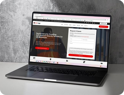
Koda Systems needed a website that made sense to real people, not just search engines. The old structure did not clearly separate domestic and commercial services, and that made the user journey harder than it needed to be. The new site was designed to fix that first. It had to look more professional, explain services more clearly, and give visitors a quicker way to find the right page.

A lot of security websites get bogged down in technical detail. This one needed the opposite. The content had to feel easy to follow, the service layout had to be cleaner, and the whole site had to guide visitors toward the right choice without making them work for it. That meant clearer pathways, stronger calls to action, and less clutter in the way.

The finished site gives Koda Systems a much stronger base to work from. It separates the service offering properly, supports local visibility, and gives the business a better platform for enquiries. It also leaves room to grow, which matters when the next campaign, location page, or service page needs to slot into place.

Koda Systems works with both homeowners and businesses across Nottinghamshire and nearby areas. Their service range is broad: burglar alarms, CCTV, smart security systems, access control, servicing, maintenance, and fault-finding. The business already had the experience. What it needed was a website that reflected that properly.
The main goal was simple enough: make the website easier to understand and more likely to convert. That meant separating domestic and commercial services more clearly, improving the way each service was presented, and creating a structure that could support local search over time. There was also a trust issue to solve. The site needed to feel more confident and more established, especially for visitors who were comparing providers or landing on the site for the first time.
The biggest challenge was clarity. The old site did not do enough to separate one audience from another, and that muddied the message. A homeowner looking for a burglar alarm does not want to dig through content aimed at a warehouse manager. The same goes the other way around. There was also a lot of room to improve the local structure. The business serves a wide area, so the site needed to handle that without becoming messy or repetitive. That balance took some thought.
Domestic and commercial services were split into clearer sections so visitors could reach the right information faster.
The service copy was rewritten to sound more direct, more helpful, and less like a generic security brochure.
Dedicated area pages were added to support regional visibility and make the site more useful for local searches.
The site was shaped to give visitors more confidence in the business, not just more information.
Calls to action were placed where they made sense, without getting in the way of the experience.
The structure was planned so the site could expand easily as new services or locations are added.
The site now makes it easier to see what Koda Systems does, who it serves, and where it works.
Visitors are no longer left guessing where to click next. The journey feels more direct.
Each main service now has space to explain the offer properly, without being crammed into a single overview.
Local pages help the business show up more naturally in searches across Nottinghamshire and Derbyshire.
The writing focuses on reassurance, practicality, and support rather than empty marketing language.
The website now has a structure that can take on new pages, new campaigns, and new content without needing to be rebuilt again.

WhatsApp us