A scalable e-commerce store built for clarity, growth, and everyday tech shoppers
Wimozee already knew how it wanted to look. Sharp. Modern. Confident. What was missing was the structure behind that vision, an online store that could handle a growing catalogue without becoming cluttered or confusing. The brief was simple: turn a strong visual identity into a store that customers could actually enjoy using.

Browsing was the priority. The store was organised around nine clear product categories, supported by filters that make sense to everyday shoppers. No endless lists. No guesswork. Product layouts stay consistent, so comparing items feels natural rather than tiring.

This wasn’t about launching something flashy. It was about building something that lasts. The final store gives Wimozee room to grow, add products, and make updates without breaking the experience or the budget every time the catalogue expands.

Wimozee Technologies specialises in everyday tech accessories, including chargers, cables, holders, stands, screen protectors, and essential home tech add-ons designed for regular, real-world use.
The client wanted a clean, modern e-commerce store that made large product categories easy to browse. The website also needed to support SEO growth and remain simple for internal teams to manage over time.
With a wide and expanding product catalogue, clear organisation was essential. The store needed flexibility to add new products and categories without increasing long-term development or redesign costs.
Before anything else, the focus was on how customers move through a tech store. Categories needed to make sense instantly, without forcing people to stop and work things out.
Products follow the same visual pattern throughout the site. That consistency removes distraction and helps shoppers focus on differences that actually matter.
The black and green palette sets the tone, but it never gets in the way. Design choices support the products instead of competing for attention.
Navigation and filtering were shaped to prevent long, frustrating scrolls. The aim was simple: fewer dead ends, fewer abandoned browsing sessions.
The structure allows Wimozee to add new ranges without rethinking the store each time. Growth feels like a natural extension, not a redesign trigger.
Category content explains what shoppers are looking at in plain terms. Not sales talk. Just enough context to help someone decide whether to keep browsing or move on.
Products were grouped into nine core categories, allowing customers to understand the store layout instantly and find what they need without excessive scrolling or confusion.
Uniform product cards and layouts were used across the store, making it easier for customers to compare items and focus on key differences rather than design variations.
The black and electric green colour palette was applied consistently across all pages, reinforcing brand recognition while keeping the interface clean and readable.
The homepage highlights key categories and featured products, naturally guiding visitors into the store using visual hierarchy rather than overwhelming promotional elements.
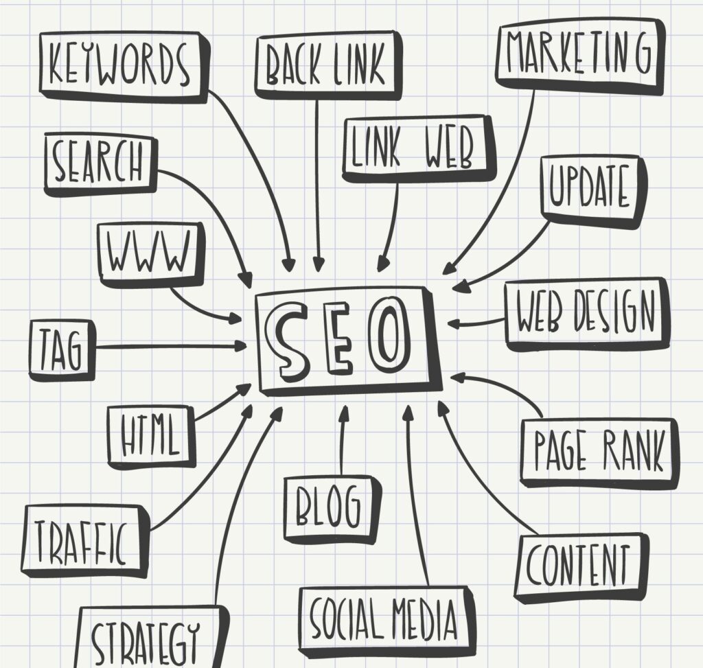
Category descriptions, metadata, internal linking, and page structure were built with search visibility in mind, ensuring the store could grow organically alongside paid and social campaigns.

WhatsApp us