A clear brand and website built to earn trust early
Scholaris Education came to us without a digital starting point. No existing brand. No established online presence. That meant freedom, but also responsibility. The vision was to create something credible from day one. A brand and website that felt serious about education, while still remaining warm and approachable for parents and students.
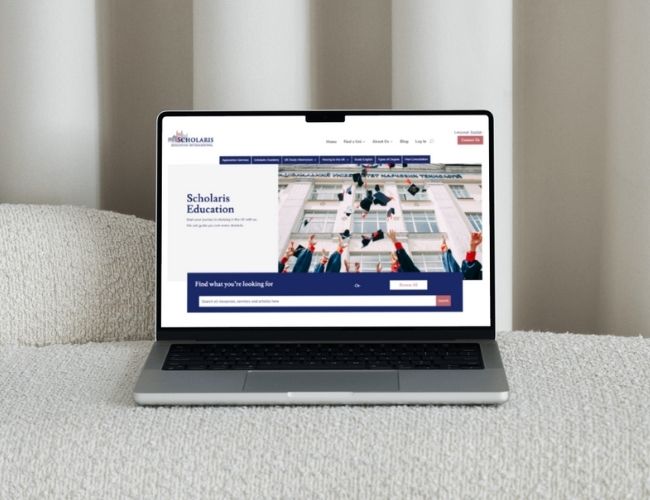
The experience needed to feel calm and focused. Nothing flashy. Nothing loud. Layouts were kept clean so visitors could read without effort. Navigation stays simple, and each page explains itself without asking visitors to work things out. From phones to larger screens, the layout stays familiar. That consistency keeps the site easy to use at every step.

This project was about more than appearance. A strong brand gives confidence before a conversation ever starts. The website helps Scholaris Education explain what they do, who they help, and why it matters. That clarity supports growth and makes first contact feel less uncertain.

Scholaris Education provides tailored tutoring support for students at different stages of their academic journey. Their approach is built around individual needs, not a fixed teaching model. This helps students grow in confidence as well as academic ability.
The aim was simple but important. Create a professional identity. Build a website that could support growth. Make it easier for parents and students to understand the service and take the next step without hesitation.
At the start, there was no clear brand structure. No visual identity. No website to build from. Everything needed to be created from scratch, while still feeling established and trustworthy from launch.
There was no brand to polish or website to refine. We made deliberate choices from the start, knowing early decisions would shape how trustworthy the business felt later.
Nothing was designed to impress for the sake of it. Spacing, colour, and layout were used to reduce noise so parents could focus, read easily, and feel at ease.
Early concepts were not rushed. We tested different directions, stepped back, and refined them together until the identity felt right, not just finished.
Content was written the way people speak when they explain something clearly. No jargon. No selling lines. Just calm, direct language that builds understanding.
The site behaves the same on every device. Pages don’t shift or surprise. Familiar patterns make navigation feel natural, whether viewed on a phone or a laptop.
Structure mattered. Page hierarchy, SEO basics, and content flow were handled early so future growth wouldn’t require rebuilding what already works.
We developed a complete brand identity that felt academic but not rigid. Professional, but not cold. Something that could grow with the business over time.
Several design routes were explored early on. This gave Scholaris Education space to react, reflect, and shape the final direction rather than being handed a single fixed option.
Content was written to sound human. No education jargon. No marketing gloss. Just clear explanations of services and values.
The website was built to work properly everywhere. Screen size doesn’t change the experience. Information stays accessible and easy to read.
SEO fundamentals were handled during build, not added later. Clean structure, clear pages, and a layout that supports future content growth.

WhatsApp us