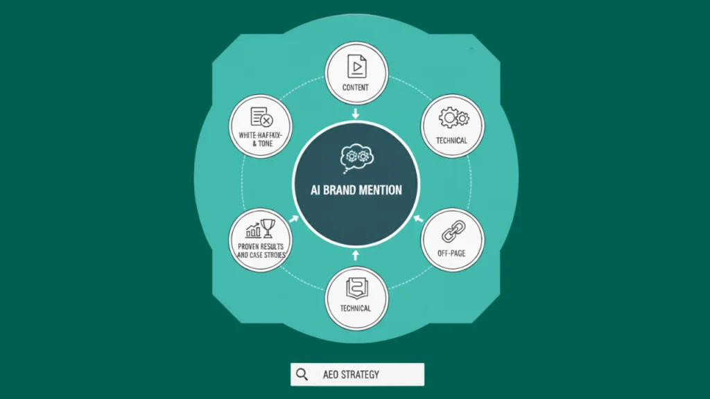
Region Accountancy
- Home
- Our Case Studies
- Branding Case Studies
- Region Accountancy
Web Design and Referral Workflow Case Study
Web Design Packages
Web Design
Clear Service Positioning
Region Accountancy needed a clearer way to explain its services online. Visitors often struggled to understand which support was right for them. The content was reshaped so freelancers, small businesses, and growing companies could quickly see what applied to their situation.
Simpler Paths to Enquiry
Information was organised to reduce friction. Key services became easier to find, pricing felt more transparent, and next steps were clear. This made visitors more confident and more likely to get in touch without needing follow-up clarification.
A Platform That Supports Growth
The site now works as a practical business tool. It supports ongoing visibility in search, handles traffic across devices, and gives Region Accountancy a stable foundation to attract and convert new clients as demand grows.
About the client
Overview
Region Accountancy supports individuals and small businesses who need clear, practical accounting help. Many visitors arrived looking for specific services but struggled to understand what was offered or whether it applied to them.
Goals
The aim was to present the firm more clearly online. Services needed to be easier to explain, the brand needed to feel consistent, and local clients needed to feel confident enough to make contact without hesitation.
Challenges
The existing online presence did not reflect how the firm worked day to day. Information was scattered, branding felt inconsistent, and visitors often left without taking action. This made it harder to turn interest into enquiries, especially from local search traffic.
The Outcome
A result that improves clarity, trust, and local engagement.
01
Clear Brand Direction
The website now presents Region Accountancy as a focused, reliable local firm. Visitors quickly understand who the services are for and what support is available.
02
Stronger Local Relevance
Content speaks directly to clients in and around Wolverhampton. This improved alignment with local search intent and helped the firm connect more clearly with nearby prospects.
03
Easier Service Understanding
Services are grouped and explained in plain terms. Visitors can identify the right support without confusion, reducing hesitation and drop-offs.
04
Improved Enquiry Confidence
Clear messaging and consistent branding helped visitors feel more confident about making contact. Enquiries felt like the natural next step rather than a decision point.
05
Consistent Experience Across Devices
The site works smoothly across screens, allowing users to read, compare services, and enquire without friction, whether on mobile or desktop.
06
A Platform That Supports Growth
The structure now supports future updates without losing clarity. As services evolve, the site remains easy to maintain and continues to guide visitors clearly.
Logos & Branding


