Mapora
- Home
- Our Case Studies
- Web Design Case Studies
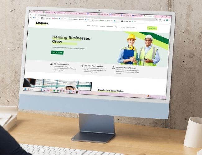
- Mapora
A modern website designed to support trust and enquiries.
About The Project
Mapora Web Design & Branding
Project Vision
Mapora needed a website that reflected where the business was heading, not where it had been. As their work with STEM companies expanded. Their online presence needed to show credibility, clarity, and confidence.
The site had to explain what they do quickly and position them as a serious consultancy. This supports long-term growth without feeling heavy or overdesigned.
Design & Experience
The focus was on simplicity and control. Pages were designed to feel calm, structured, and easy to navigate. This allows visitors to understand Mapora’s services without digging.
Content hierarchy was tightened so key messages surfaced early. Layouts stayed consistent, helping users move through the site without friction. The result was a cleaner experience that made the business feel more established and easier to trust.

Purpose & Impact
The goal wasn’t just a better-looking site. It was to create a clearer digital presence. And this will support credibility, visibility, and future growth.
By reducing noise and sharpening how services were presented, the website became a more effective tool. And introducing itself to the business and supporting enquiries.

The Client
Lead Generation, Business Development, and Strategic Consultancy
Overview
Mapora works with STEM-focused organisations. It helps them grow through targeted support and commercial strategy. Their audience expects clarity, professionalism, and confidence from the first interaction.
Goals
The goal was to strengthen Mapora’s online presence. The website needed to feel modern, credible, and easy to understand. Also, stay supporting long-term visibility and business growth.
Challenges
Mapora needed a site that clearly communicated expertise without overwhelming visitors. It had to work smoothly across all devices and present the business. In this way, they matched the level of clients they support.
Our Approach
What changed to improve results
Clear Service Positioning
Services were presented with sharper focus. This helps visitors understand what Mapora offers and who it’s for.
Simplified Page Structure
Content was organised to reduce friction and guide users naturally through the site.
Consistent Visual Direction
A restrained visual style helped reinforce professionalism without distracting from the message.
Mobile-First Clarity
The experience remained clear and usable regardless of screen size. Also, they support modern browsing habits.
Search-Friendly Foundations
Pages were structured to support long-term visibility without relying on heavy optimisation tactics.
Growth-Ready Layout
The site allows for future expansion without needing structural changes.
The Outcome
Clear improvements driven by focus and structure
01
Stronger Brand Credibility
The website now reflects Mapora’s position as a serious consultancy within the STEM space.
02
Improved Message Clarity
Visitors understand services faster, reducing confusion and drop-off.
03
Better Engagement
Clear layouts encourage users to explore more than one page.
04
Consistent Cross-Device Experience
The site performs reliably on desktop, tablet, and mobile.
05
Increased Enquiry Confidence
Clear presentation supports trust at the point of decision.
06
Long-Term Digital Foundation
The website now supports ongoing growth without needing rework.