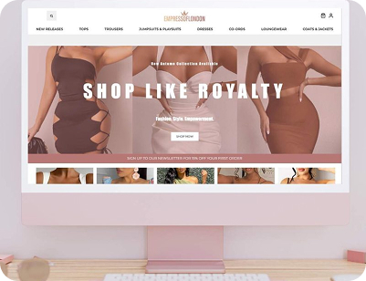
A fashion launch designed to move fast and look confident
Empress of London didn’t want a soft launch. The ambition was bigger than that. From the start, the brand set out to compete with recognisable high-street names. The website had to reflect that confidence. Not experimental. Not tentative. Something bold enough to feel established, even on day one.

Fashion shoppers are impatient. They know what they want and move quickly. The site was built with that in mind. Strong visuals lead the way, but nothing gets in the way. Browsing feels natural. Pages load fast. The experience stays smooth whether users are scrolling casually or shopping with intent.
This wasn’t just about selling products. It was about creating a rhythm. A place people want to return to. The website supports browsing, impulse buys, and repeat visits, while reinforcing a visual identity that feels current and wearable, not overstyled.

Empress of London is a womenswear brand offering trend-led, affordable fashion. Entering a crowded market, the brand positioned itself confidently alongside established names while carving out its own visual space.
The aim was to launch with clarity. A sleek e-commerce site that made shopping easy, looked polished, and supported early momentum. Sales mattered, but so did recognition and consistency.
Starting from scratch leaves no room for error. The challenge was balance. Strong visuals without slowing performance. A premium feel without adding friction. Everything had to work together from the first click.
Fashion launches do not get warm-up time. Decisions were made quickly and deliberately, with momentum in mind. Layout, navigation, and visual hierarchy all support fast movement. The site never pauses to explain itself. It keeps pace with how fashion shoppers actually behave.
Shoppers arrive with expectations shaped by major retailers. Those cues were respected, not replicated. Spacing feels confident, and navigation feels familiar. The brand still stands on its own, with restraint preventing it from blending into the crowd.
Load time, responsiveness, and flow were treated as core features, not technical details. Delays break intent, and friction erodes confidence. Every interaction is built to feel immediate, especially on mobile, where most decisions now happen.
Imagery leads, but never overwhelms. Products remain the focus, while supporting elements stay quiet. The design frames the clothes instead of competing with them. When visuals feel confident, shoppers spend less time questioning and more time choosing.
Filtering and browsing tools were kept purposeful. There is enough structure to guide choices, without limiting exploration. Clear paths prevent overload and help shoppers move forward naturally.
The platform was structured to scale from day one. New collections, campaigns, and categories can be added without rework. Early momentum matters, but longevity matters more. The site is built to evolve alongside the brand, not hold it back.
The visual direction took cues from leading fashion retailers, but avoided imitation. Clean layouts. Confident spacing. A look that feels familiar, yet distinct.
Users can shop by category or explore curated collections. Some people browse with purpose, while others wander. The site supports both.
Filtering tools help users narrow choices quickly by size, category, or colour. There’s nothing excessive, just enough to keep things moving.
The checkout flow was kept short and contained to a single page. Clear actions and options like Klarna and Clearpay add flexibility without pulling focus.
Mobile use drives the design decisions here. The site stays quick to load, simple to tap through, and visually consistent.

WhatsApp us