Introduction
Did you know that poor website design can significantly impact user retention? A poorly designed website can drive users away, often causing them to not return. In fact, 75% of users judge a business’s credibility based on its website design, according to BusinessDasher.
For business owners, your website is more than just an online presence – it’s your first impression, digital storefront, and one of your most powerful marketing tools. While a poorly designed website can deter potential customers, a professional and user-friendly site can build trust, boost engagement, and drive sales.
However, designing a website that meets today’s best practices can quickly become overwhelming. That’s why, in this article, we’ll walk you through 10 essential web design principles that can help ensure your website creates a great first impression and keeps users coming back.
1. Prioritise Mobile-Friendly Design
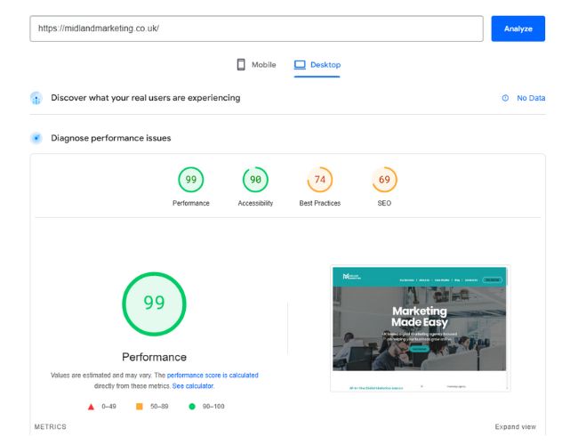
Why it Matters: With over 60% of web traffic now coming from mobile devices, having a mobile-friendly website is essential. Today’s customers expect a seamless browsing experience, whether they’re visiting on a smartphone, tablet, or desktop. If your site is difficult to view or navigate, visitors are likely to leave and turn to a competitor with a better user experience.
What You Can Do: As you build your website, test it on multiple devices to ensure your pages are responsive and display as intended. You can also use tools like Google’s Lighthouse to evaluate how mobile-friendly your site is. Additionally, consider using responsive design frameworks like Bootstrap to ensure your site looks great on screens of all sizes.
2. Optimise Loading Speed
Why it Matters: Page speed plays a crucial role in conversion rates. In fact, conversions drop by 7% for every second of delay. Slow-loading websites can lead to frustration in visitors, causing them to leave before they even have a chance to view your content.
What You Can Do: Tools like Google’s PageSpeed Insights can help you identify speed issues on both the mobile and desktop versions of your website, along with offering actionable recommendations for improvement. Additionally, small adjustments like optimising images, enabling browser caching, and using a Content Delivery Network (CDN) can significantly boost loading times.
3. Keep Navigation Clean and Intuitive
Why it Matters: Intuitive, easy-to-use navigation helps users quickly find the information they need. Poor navigation, on the other hand, can confuse visitors and drive them to competitor sites. Additionally, effective navigation enhances accessibility for users with disabilities. Properly labelled and well-structured navigation links are crucial for screen readers and assistive technologies, making your site more inclusive and compliant with accessibility standards.
What You Can Do: Simplify your menu to highlight key areas of your site, such as services, products, or contact information. Adding a search bar can further streamline navigation. Also ensure that buttons and links are properly spaced and clearly labelled to be fully accessible to screen readers and assistive technologies.
4. Focus on Strong Calls-to-Action (CTAs)
Why it Matters: Your CTA is the bridge that connects visitors to the action you want them to take. Whether it’s signing up for a newsletter or making a purchase, a compelling CTA can significantly boost conversions. To be effective, your CTA should stand out from other elements on the page and be clear about what the user is clicking on.
What You Can Do: Use action-oriented, descriptive language for your CTAs, such as “Get Your Free Quote” or “Shop Now”. It’s also important to place your CTAs strategically, typically above the fold, within relevant content, or at the end of blog posts. Ideally, each page should have one clear CTA to make it easy for users to take action without searching. The simpler and more straightforward the process, the more likely they are to convert.

5. Emphasise Visual Hierarchy
Why it Matters: Visual hierarchy helps guide users’ attention to the most important elements on your page. It also plays a key role in helping readers navigate your content in a logical, intuitive way – even on a subconscious level. Without a clear visual hierarchy, users may feel overwhelmed and even miss critical information.
What You Can Do: Use larger fonts for headlines, bold colours for CTAs, and strategic placement of key elements to naturally guide the user’s eye. You can also leverage whitespace, texture, and style to make important elements stand out even more.
6. Follow an F-Shaped Pattern Structure
Why it Matters: Building on the concept of visual hierarchy, it’s important to follow the ‘F’ pattern when designing your website. Users tend to read from left to right and top to bottom. Typically they’ll first focus on headlines, then scan the left side for sidebars, content, or key information, before moving across the page to catch any remaining important details.
What You Can Do: Structure your website content to align with the ‘F’ pattern, making it easy for users to navigate and quickly find the most important and relevant information. Apply visual hierarchy techniques, such as using bold typography and colours for headlines in the top left corner. Follow that with an image or CTA on the right, then continue with the rest of the content in a logical order below.
7. Leverage the Power of White Space
Why it Matters: White space (or negative space) helps declutter your website, improving both readability and overall user experience. It gives your design a clean, professional look while drawing attention to the most important content on the page.
What You Can Do: Avoid overwhelming users with too much information in a single section. Give your content room to breathe by adding space between text, images, and other elements using padding or margins.
8. Use Colours That Work Together in Contrast
Why it Matters: Colour is a powerful element in website design that can captivate users’ attention, far more effectively than a simple black-and-white scheme. Your website’s colour palette sets the mood and tone of the entire design, so it’s crucial to choose colours that complement and work well together.
What You Can Do: A good rule of thumb for website design is to use no more than three colours: a primary colour, a secondary colour, and an accent colour. Use these colours in moderation to break up white space and create a balanced design. However, this rule isn’t set in stone, and additional colours can be used as long as they complement each other and don’t create an overwhelming or chaotic look.

9. Web-Friendly Typography
Why it Matters: Typography plays a crucial role in web design, contributing to both the attractiveness and professionalism of a website. Choosing the right font can significantly impact the readability of your content and the overall user experience.
What You Can Do: Choose a typeface that reflects your brand’s personality while remaining easy to read and compatible with web browsers. This ensures that your fonts display properly for both mobile and desktop users. Additionally, pay attention to font size – if users have to squint to read your text, it’s time to increase the size to improve readability and reduce eyestrain.
10. Consistency is Key
Why it Matters: Of all the web design principles discussed in this article, consistency is one of the most important. A uniform design across your site makes it feel polished and professional while reinforcing your brand identity. In contrast, an inconsistent design can appear chaotic and confuse users, detracting from their experience.
What You Can Do: Maintain consistency in your fonts, colours, and images across your website to reinforce your brand identity. Additionally, pay attention to design elements such as padding, spacing, and image dimensions. These details contribute to the overall uniformity of your site, ensuring it feels clean, cohesive, and polished.
The Importance of Web Design for Businesses
The importance of web design in business begins with the first impression. Just as an attractive storefront display draws customers into a physical shop, a well-designed website captures the attention of online visitors.
To convert potential customers, your website must first engage them with a professional, visually appealing design. Easy navigation ensures users can smoothly explore your site, while white space and complementary colours effectively communicate your brand’s message and values. Finally, strategically placed call-to-action buttons guide visitors toward the actions you want them to take – whether it’s making a purchase, signing up, or reaching out.
Your website is one of the most powerful tools for growing your business. By implementing these 10 web design principles, you can create a site that’s not only visually appealing but also functional and conversion-focused.
If you’re feeling overwhelmed or unsure where to start, we’re here to help! At Midland Marketing, we specialise in creating websites that drive results for businesses.
Want some more?
Latest Insights & News

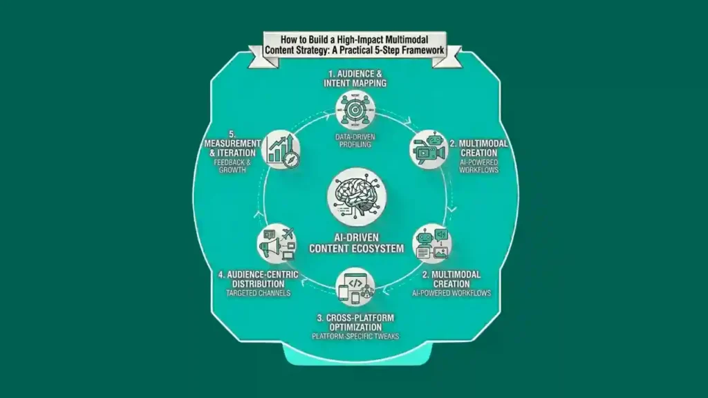
How to Build a High-Impact Multimodal Content Strategy: A Practical 5-Step Framework
Introduction A multimodal content strategy is more than a list of channels. It is a plan that links formats, platforms and goals. This guide shows
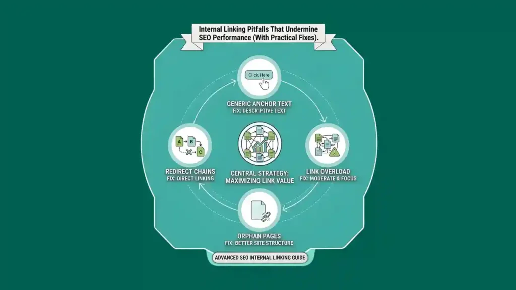
Internal Linking Pitfalls That Undermine SEO Performance (With Practical Fixes)
Introduction Internal links often get ignored because nothing seems broken at first. Pages open. Menus work. Content goes live on schedule. Still, many ranking drops

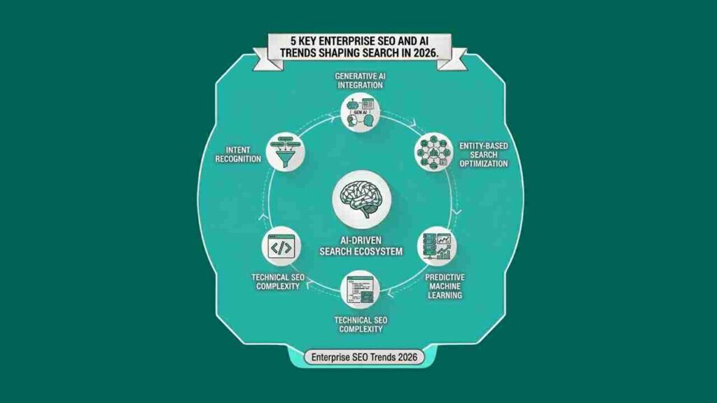
5 Key Enterprise SEO and AI Trends Shaping Search in 2026
Introduction Search is changing in quiet ways. Rankings still move up and down. Reports still show keywords. But search engines now look deeper. They try