Introduction
Have you ever visited a website on your phone, only to find out that you had to pinch and zoom just to read the text or tap a button? Or maybe you had to scroll horizontally just to see the full page’s content? Those are classic signs of a non-responsive website.
Non-responsive websites can be incredibly detrimental to the performance of your brand, potentially costing you customers, leads, and sales.
In today’s age, it’s absolutely essential to have a website that can adapt to a range of devices — especially when 95.9% of users will access the internet through their phone at some point. This is what makes responsive web design (RWD) a crucial element for your website.

What is Responsive Web Design?
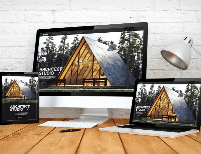
Responsive web design is the approach to building websites that automatically adjust their layout and content to fit the screen they’re being viewed on. Tablets and mobile devices are typically the ones to benefit the most from responsive design, since websites are typically built on laptops or desktop devices, acting as a default device.
However, rather than creating multiple versions of your website for different devices, responsive sites use flexible layouts, images, and CSS media queries to seamlessly adapt to other screen sizes. Ultimately, the goal of RWD is simple: to provide a smooth and accessible browsing experience for users regardless of their device.
Why Responsive Design Matters
For any business, but especially small to medium-sized enterprises (SMEs), your website is often your first (and sometimes only) chance to make a strong impression on your users. And when mobile platforms now account for over 60% of web traffic, your site needs to perform flawlessly across devices.
Here are some of the reasons you should take responsive web design seriously:
- Mobile Traffic Dominates – If your site isn’t mobile-friendly, you’re missing out on a large audience you could potentially be reaching.
- User Expectations are High – People expect fast loading times and smooth navigation by default.
- You Compete with Big Brands – A polished, responsive website helps you appear more professional and trustworthy.
- Every Interaction Matters – A frustrating mobile experience can drive people straight to your competitors.

Benefits of a Responsive Website
Investing time and resources into ensuring your website’s design is fully responsive can offer a wide range of advantages in return:
- Improved User Experience – Visitors can easily read content, find their way around your site, and click on buttons or fill out forms with ease — regardless of the device they’re on.
- Better SEO Performance – Responsive web design plays a core part in SEO rankings now, since Google prioritises mobile-friendly websites in search rankings. This has the potential to give you a competitive edge when it comes to visibility.
- Cost-Effective – As opposed to needing multiple websites — with one catering to each device — with responsive web design, you only need one website that works across all devices. This can save you a significant amount of time and additional development costs.
- Higher Conversion Rates – The easier it is for users to browse and buy from your range on different devices, at their convenience, the more likely they will be to complete a purchase or inquiry.
How Does Responsive Design Work?
At its core, responsive design uses flexible grids and layouts to make your website “fluid” — though there are many other elements that can be adjusted to improve this effect.
But what exactly are these elements, and how do they allow your page content to shift and resize depending on the screen size?
- Responsive Layouts – Using fluid grids allows them to be sized with percentages, rather than fixed pixel measurements, which is how they smoothly scale depending on screen size.
- Responsive Images – Responsive images works almost identically. Though be careful to differentiate between the width and max-width properties, as width will scale and exceed the original image size, whereas max-width will not.
- CSS Media Queries – Media queries are great for letting you create layouts based on fixed resolutions, orientations, and sizes.

Responsive vs. Mobile-Only Design
Businesses may sometimes choose to do a mobile-only website, or a separate mobile version, as opposed to a responsive design. While this can work, it often results in extra maintenance and can lead to inconsistent user experiences if the proper care isn’t taken.
In general, responsive design tends to be the less-maintenance-intensive and future-proof choice because:
- RWD provides a consistent experience across all devices given it’s the same website, just resized to fit the resolution of your current device.
- Responsive web design is far easier to update and manage since your website is all in one place, as opposed to having multiple sites to worry about.
- It improves your SEO ranking, since you have one unified website, rather than multiple sites potentially competing with one another.
How Do You Check if Your Website is Responsive?
Are you unsure if your website is responsive? There are two very quick and easy ways to find out:
- Resize Your Window – If the layout of the webpage shifts and content adjusts smoothly with the screen size, it’s most likely responsive.
- Use Google’s PageSpeed Insights Tool – Enter the URL of your site into Google’s PageSpeed Insights tool, and watch as the results come back to you. If your website is poorly optimised for mobile, it may be time to take action and change that.
What Are the Next Steps?
If your website isn’t responsive yet, don’t worry. There are countless practical steps you can take:
- Building Your First Website? Ensure you take a mobile-first approach to the design. If you’re going through a web designer or web developer, ask them to design and build it with mobile platforms in mind, utilising responsive design principles.
- Using a Website Builder? Try to use visual builders or themes that already have responsive designs incorporated into them, saving you from having to manually code that aspect.
- Already Have a Site? Ask a web developer or marketing agency to review your existing site and suggest any improvements you could make.
Conclusion
Mobile-friendly and responsive web design is no longer just a design trend, but an essential principle of web design. It acts as an opportunity to stand out, better serve customers, and grow your digital presence with confidence.
The last thing you should do is let an outdated website hold your business performance back. If you’re unsure about whether your website is responsive or not, it’s worth reaching out to a web developer or marketing expert and asking them to check for you. A responsive website can be the key to opening doors to more traffic, quality engagement, and increased sales.
If you’re feeling overwhelmed by your website design, we’re here to help! At Midland Marketing, we specialise in creating responsive websites that drive results for businesses.
