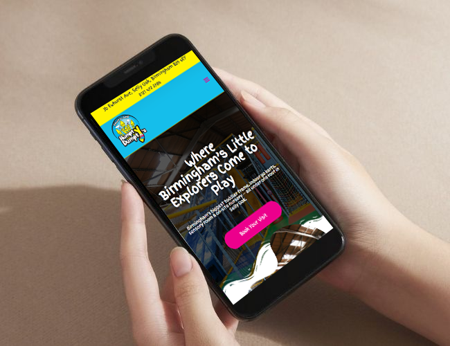
Humpty Dumpty’s Adventure Land

Website Design Case Study

Humpty Dumpty’s Adventure Land

Website Design Case Study

Website Design & User Experience

Creating a Family-Friendly Digital Experience

Humpty Dumpty’s Adventureland needed a website that reflected the fun, warmth, and energy of their venue while making it easy for parents to understand what’s on offer. With multiple attractions under one roof, the challenge was to present everything clearly without overwhelming visitors.

The​‍​‌‍​‍‌​‍​‌‍​‍‌ website design was basically aimed at one straightforward objective: Enable families to locate the activity they want in the shortest possible time and figure out the next step at a glance. Clear visual routes from the home page lead users to activities such as soft play, sensory rooms, go-karts, parties, and the on-site nursery.

The​‍​‌‍​‍‌​‍​‌‍​‍‌ completed website is cheerful, inviting, and user-friendly. It is reflective of the atmosphere at the venue; however, it also provides parents with the necessary clarity and reassurance when they are scheduling a visit, reserving a party, or submitting a ​‍​‌‍​‍‌​‍​‌‍​‍‌query.

Humpty Dumpty’s Adventureland

About the client

Overview

Humpty Dumpty’s Adventureland is a family entertainment venue offering a range of indoor activities for children of different ages. Alongside soft play, sensory spaces and indoor go-karts, the business also operates The Railway Children’s Day Nursery as part of its wider offering.

Goals

The​‍​‌‍​‍‌​‍​‌‍​‍‌ aim was to design a visually appealing and user-friendly website that connects all attractions under a single brand. Parents required an effective means of browsing activities, checking prices and opening hours, and making enquiries without getting mixed ​‍​‌‍​‍‌​‍​‌‍​‍‌up.

Challenges

With multiple services aimed at different age groups, the website needed a strong structure and intuitive navigation. The nursery also required its own dedicated space within the site, with a layout that felt appropriate for early years care while remaining connected to the main Adventureland experience.

Experience Design & Site Structure

Structuring the Website Around Families’ Needs

The​‍​‌‍​‍‌​‍​‌‍​‍‌ design of the site was aimed at giving the vibe of being playful and friendly, however, it was also kept very simple in order to be easily navigable. The website is designed so that each attraction gets an obvious highlight, allowing parents to go straight from the main page to the section most useful to them.

The info is broken down into neat, easily readable pieces that take visitors just a few moments to grasp the content of each section: suitability, facilities, pricing, and the following steps. Party plans are presented in an easy-to-compare format; the nursery page, meanwhile, employs a tranquil design that reflects the emphasis on care, learning, and support.

Throughout the site, consistent calls to action encourage enquiries without pressure. The overall design balances fun and clarity, making it easier for families to plan visits with confidence.

Outcomes

Project Results

Experience Areas Clearly Presented

0 Core

Mobile-Friendly Experience

0 %

Unified Digital Journey

0

More Case Studies

Other PPC Clients

Photobomb

The Neurodiversity Show

Ice Cream Tuk

Get started with a quote

Ready to Grow Your Business?