


Introduction
At first glance, you might not consider typography to play a critical role in web design. However, this couldn’t be further from the truth. If you come across a website using Comic Sans? You’re not going to take them seriously, which damages brand trust and reputation.
This is because fonts and typefaces play a key part in how your brand is perceived — and it doesn’t just end there! They’re also incredibly important when making sure your website is accessible, and of course, that it looks good.
As a website owner, it’s integral to consider the message that your choice of fonts sends to your users, and actually lets them engage with your content.
In this guide, we’ll cover the most important concepts of typography and web design, explain why it matters to your brand, and offer practical tips to help you make better font choices for your website.
What is Typography in Web Design?
Typography in web design is the artful practice of arranging text on a website with the end goal of making it both visually appealing and easy to read. So, naturally, there’s a lot more to typography than just choosing a font. Aspects like styling, spacing, sizing and structure all need to be taken into consideration as well.
At its core, typography works to:
- Set the tone of your brand
- Guide users through your content
- Create hierarchy so users know what to read first
- Improve usability by visually breaking information up
In web design, typography considers things like choice of fonts, proper line spacing, text alignment, and even how your fonts display across different screen sizes, devices, and browsers.
Unlike print, you also need to consider how fonts might impact the responsive design of your website, whether it’s accessible to users with certain impairments, and whether it loads quickly enough to keep up with user expectations.
Core Concepts of Typography in Web Design
Before we look at some typography best practices, it’s important to get familiar with some of the basic terms you’re likely to come across.
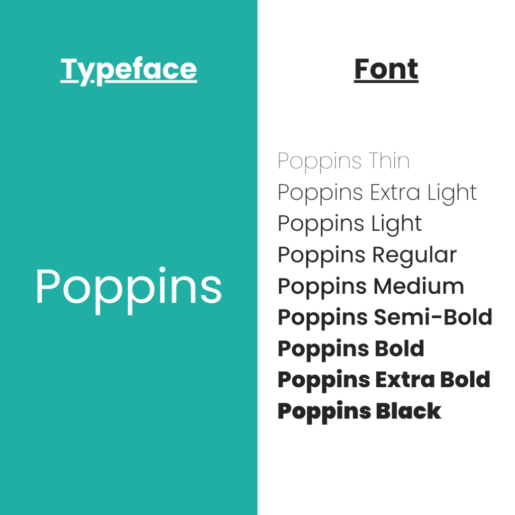
- Typeface vs Font – These terms are often used interchangeably, but they’re not quite the same. A typeface is the design of the characters. Examples include Arial, Calibri, Poppins, and Times New Roman. Fonts, on the other hand, are styled versions of the same typeface, like bolder or lighter, smaller or larger, or even italicised and non-italicised.
- Font Family – A font family is the alternate term for a collection of the same typefaces, that vary in style, weight, width, and other features.
- Serif vs Sans-Serif – Serif fonts are a version of a typeface with decorative strokes at the ends of letters (e.g. Times New Roman), while sans-serif fonts (Arial, Helvetica, etc.) don’t feature these strokes (“sans” is French for “without”).
Essential Web Typography Terms You Should Know
In addition to the fundamentals of web typography, it’s important to become comfortable with the different elements that can affect the appearance of it. Understanding these terms and what they affect helps you to communicate more confidently with web designers and make better decisions for your site:
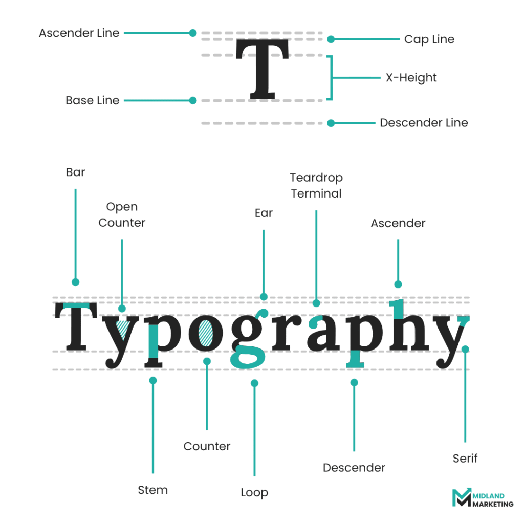
Kerning
Kerning is the space between two specific characters. Depending on the characters being adjusted, kerning can either be made smaller or wider. Good kerning creates a balanced and polished look, and helps to distinguish between individual characters.
Tracking
Similar to kerning, but refers to the spacing between all the characters in a body of text, instead of between specific characters. Too much or too little tracking can make content hard to read, so it’s important to balance it carefully.
Leading
Leading (pronounced like “led”) is the vertical spacing between lines of text, as opposed to horizontal spacing, like kerning and tracking. If leading is too tight, it can be difficult to follow lines, and bodies of text start to feel cramped. However, too much can also make text hard to follow by making it feel too disjointed.
White Space
Another form of spacing, but one not strictly used in typography. White space, also called negative space, is the empty area around text. This can include the space in margins, borders, or other spacers. It helps to avoid cluttered visuals, and naturally draws attention to content on the page, as well as improving focus.
Contrast
Contrast is important for accessibility. It’s the difference between the values in your background and any text on the page. You should always aim for your text to be high contrast (e.g. black on white) so users with colour blindness or other visual impairments can still read your content.
Hierarchy
Hierarchy refers to the structuring of your text, usually done with headings, subheadings, and body text, so users subconsciously know what’s more important. Naturally, the bigger text is, the more important it will look, so readers will be most likely to look at that first.
Alignment
This is what ensures your text is lined up neatly. It helps users to skim read text, or read more efficiently in general. There are different types of alignment (left-aligned, right-aligned, centred, and justified) but you should always aim to use one type of alignment per page. Suddenly switching how your text lines up can confused users, and disrupt the flow of the page.
How Typography Reinforces Brand Identity
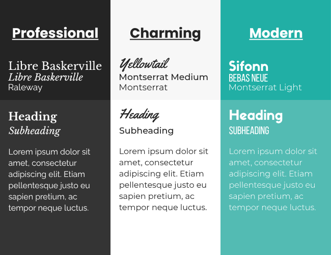
As mentioned previously, web typography is a very useful tool in terms of helping to set the tone for your brand. Typefaces and fonts essentially work as clothing for your brand:
- A website that wants to come across as more trustworthy and professional may use a serif font.
- A website that wants seem charming and creative might use a less formal, handwritten or script font.
- A website that wants to appear modern and efficient is likely to use a sans-serif font
Your choice in font helps to show visitors who you are, rather than explicitly telling them.
How do You Choose the Right Fonts for Web use?
Not every font is suitable for use across the web, as they’re not guaranteed to display on other devices or browsers. When looking for potential font ideas for your brand, keep in mind:
- Readability is Crucial – You need to stick to legible fonts for body text, especially on mobile devices where fonts will already display quite small and cramped. If possible, you should save more decorative fonts for headings or accents on your site.
- Stick to 2 or 3 Fonts – If you want to ensure your website feels consistent and is user friendly, you shouldn’t use any more than 3 fonts. Too many fonts can make the website feel heavily disjointed, and more like a scrapbook.
- Use Web-Safe Fonts – Potentially the most important factor to consider when picking a font for your website. After all, what’s the point in using a font that no one can see or read? You can use platforms like Google Fonts to find guaranteed web-compatible fonts.
- Choose Responsive Fonts – Not only is it important to choose fonts that are legible in browsers, but you also need to consider how they look on different devices. Make sure your fonts fit the size of the screen they’re displayed on, and don’t become distorted or too cramped.
The SEO and UX Benefits of Good Typography
Typography helps to do more than subtly convey your brand voice to your audience. It can bring actual performance benefits along with it, too:
- Clean, legible fonts mean people will read your content, keeping them on your site for longer, ultimately reducing bounce rates.
- Fonts that load quickly help to benefit site speed, which is an important ranking factor for Google.
- Accessible typography means that your content reaches wider audiences, like people using screen readers, or those suffering from colour blindness.

Web Typography Guidelines
You don’t need to have a degree in design to be good at typography, as long as you understand what contributes to a good UX and UI experience for web users. Here are some important guidelines to keep in mind when trying to meet the needs of users:
1. Prioritise Readability
This should be one of your first priorities when picking typefaces to use on your website. Ideally, your font should be easy to read on all devices, which means avoiding overly decorative fonts for body content. Text size also needs to be larger for comfortable reading, which typically tends to fall between 14px and 18px. It’s also generally good practice to avoid using serif fonts for body text, though this isn’t as crucial as the other steps, as long as the serif doesn’t take away from the readability too much.
2. Pair Complementary Typefaces
If you plan on using more than one typeface across your website, then it’s important that you pick ones with a good synergy between them. However, you should still try to make sure that they’re visually distinguishable from one another. Examples of complementary font pairings include:
- Libre Baskerville & Montserrat
- Spectral & Karla
- League Spartan & Libre Baskerville
No plans to use 2 fonts? There are some exceptional fonts that work well using styles from their font families. Some examples include:
- Poppins
- Libre Baskerville
- Lora
3. make Use of White Space
Don’t be afraid to use white space. Make sure there’s enough space between characters and lines using techniques like kerning, tracking, and leading. This is what makes gives your site that open and modern feel. The strategic use of white space also helps to draw attention to bodies of text, making content easier to navigate.
4. Avoid Using Justified Text
While fully justified text may seem visually satisfying, as it creates even blocks of text, it can actually be a readability nightmare. It can create awkward spaces between words, leaving text feeling either too cramped or too spacious. For people with reading difficulties, like dyslexia, this can very quickly make reading text an unpleasant experience.
5. Avoid using all caps for paragraphs
When capitalised words are used sparingly, they can be a decent tool for creating emphasis on something otherwise plain. However, overusing caps, by capitalising too much text, can actually negatively impact the legibility of your site. If capitalisation is excessively used, content begins to come across as aggressive. It also becomes hard to skim read, since all words start to look the same, with no variation in the height of characters. If you’re looking to emphasise options, it’s preferable to use bolded or italicised text instead.
6. Be Mindful of Line Length
The perfect line length is widely speculated across online spaces, though the general consensus seems to point towards the optimal line length falling anywhere between 50-80 characters. This improves readability by reducing eye strain and helping users keep track of where they are on the page. If your text is too narrow, pages can feel cramped. But if your text is too long, then it becomes hard to follow along.
7. Consider your use of colours
You need to make sure your text contrasts well with the background across all sections on your website. However, it’s also important to consider colour combinations that help to reduce eye strain even further. Whilst dark text on a light background is great for readability, the bright screen can very quickly cause eye strain in dark environments. Dark text on a light background, on the other hand, is generally the easiest to read. You should also be mindful not to use too many colours across your site, as this can distract users and make your site look less professional.
Conclusion
It can be easy to think that typography is just a means to an end for picking fonts that look good on your site, but in reality, it’s so much more than that. Web typography is the art of visually speaking about your business, before users have even read so much as a sentence of your page.
From choosing the right combination of typefaces to convey your brand as trustworthy, modern, or creative, to making sure that it’s still readable and accessible for those with visual impairments. There’s a lot more that goes into typography than initially meets the eye.
If your website’s text feels cluttered, hard to read, or doesn’t reflect your brand, it might be time for a rethink. And if you’re unsure where to start, working with a designer or digital marketing agency can help you to see font choices that align with your branding and business goals.