Introduction
When building a brand online, it’s all about making an impact. There’s nothing more important than the first impression, and you want it to be a strong one. And whilst there are some powerful visual elements for creating good first impressions, none are quite as effective as colour.
The colour of a website alone can speak volumes about who you are, what you do, and how you want to make your audience feel.
For businesses that are working hard to find their brand’s footing for the first time, having a well-thought-out colour palette is essential.
In this article, we’ll look at how you can strategically use colour in web design to strengthen your brand identity, connect with your audience, and improve your site’s engagement.

Why is Colour So Important in Branding?
In a world where competition is growing continuously more fierce, first impressions matter. However, they’re often formed within seconds, and when studies show that up to 90% of a user’s initial judgement about a product or brand can be based on colour alone, choosing the right colours for your brand is no small task.
Take Coca-Cola’s iconic red for example. The colour choice stemmed from a practical feature that helped the drink to stand out in the first place. In the brand’s early days, Coca-Cola barrels were painted a bright red to distinguish them from barrels of alcohol. The company’s bookkeeper then realised how good the contrast looked when paired with a clean white, which caused the bold red-and-white combination to quickly become central to the brand’s identity.
At the time, the red was so unique that customers began associating it with boldness, energy, and passion, which were qualities rarely seen in other brands’ packaging at the time. Today, Coca-Cola’s red remains its most recognisable feature. Spot a red disc icon in or on any store, and chances are, Coca-Cola is sold there.
Much like in Coca-Cola’s case, when used effectively, colour can become a visual signature for your brand, helping to boost brand awareness by as much as 80%.
Introducing the Colour Wheel
So, where do you begin with picking the colours for your website design?
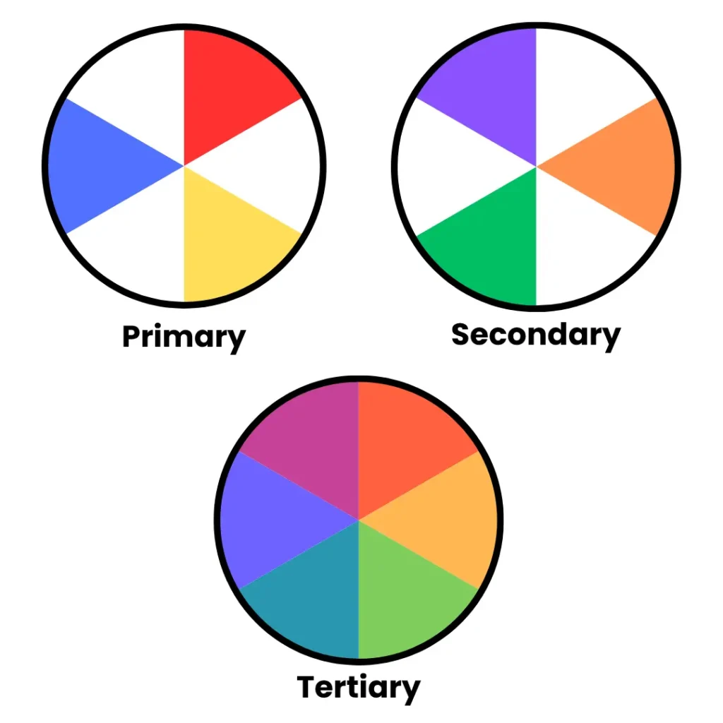
It all starts with the colour wheel. The colour wheel is the foundation of all colour design, helping you to understand how colours relate to one another and how you can pair them effectively. Colours can be split into three key groups:
- Primary Colours: The classic red, yellow, and blue. Colours that can’t be made by mixing other colours together.
- Secondary Colours: Made by mixing together any two primary colours. These are purple (red & blue), orange (yellow & red), and green (yellow & blue).
- Tertiary Colours: Made by mixing a primary and secondary colour together. This creates a much wider spectrum of colour for you to create with.
Understanding Colour Psychology
Building on the basics of the colour wheel, each colour is associated with its own emotions and imagery, which makes them a powerful tool for expressing your brand’s personality. As a quick breakdown:
- Red – Passion, love, power, anger, or danger
- Orange – Creativity, confidence, energy, health, or fun
- Yellow – Warmth, happiness, friendliness, optimism, or youth
- Green – Nature, freshness, balance, healing, or quality
- Blue – Trust, calmness, wisdom, authority, or stability
- Purple – Royalty, luxury, ambition, fantasy, or spirituality
- Pink – Romance, innocence, playful, delicate, or caring
- Brown – Earth, outdoors, dependability, reliable, or approachable
- Black – Sophistication, formality, authority, power, or elegance
- Grey – Neutrality, strength, boredom, sadness, or balance
- White – Cleanliness, purity, light, innocence, or hope
When choosing the colour scheme for your website, make sure you carefully consider your target audience and the emotions you’re trying to evoke. Do some careful research into how different cultures might perceive different colours, as not all cultures see colour in the same way.
As a result of this general rule of thumb, though, more corporate businesses, like banks, are likely to strive towards blues and greys, as they give a sense of authority and trust. On the other hand, creative agencies are likely to go for brighter, bolder, and more expressive colours, like oranges and yellows.
How to Choose the Right Colour palette for Your Website
If you’re struggling to settle on colour in web design, consider using a colour from your logo as a starting point. Make sure that this colour sends the message you want it to, using colour psychology as a reference.
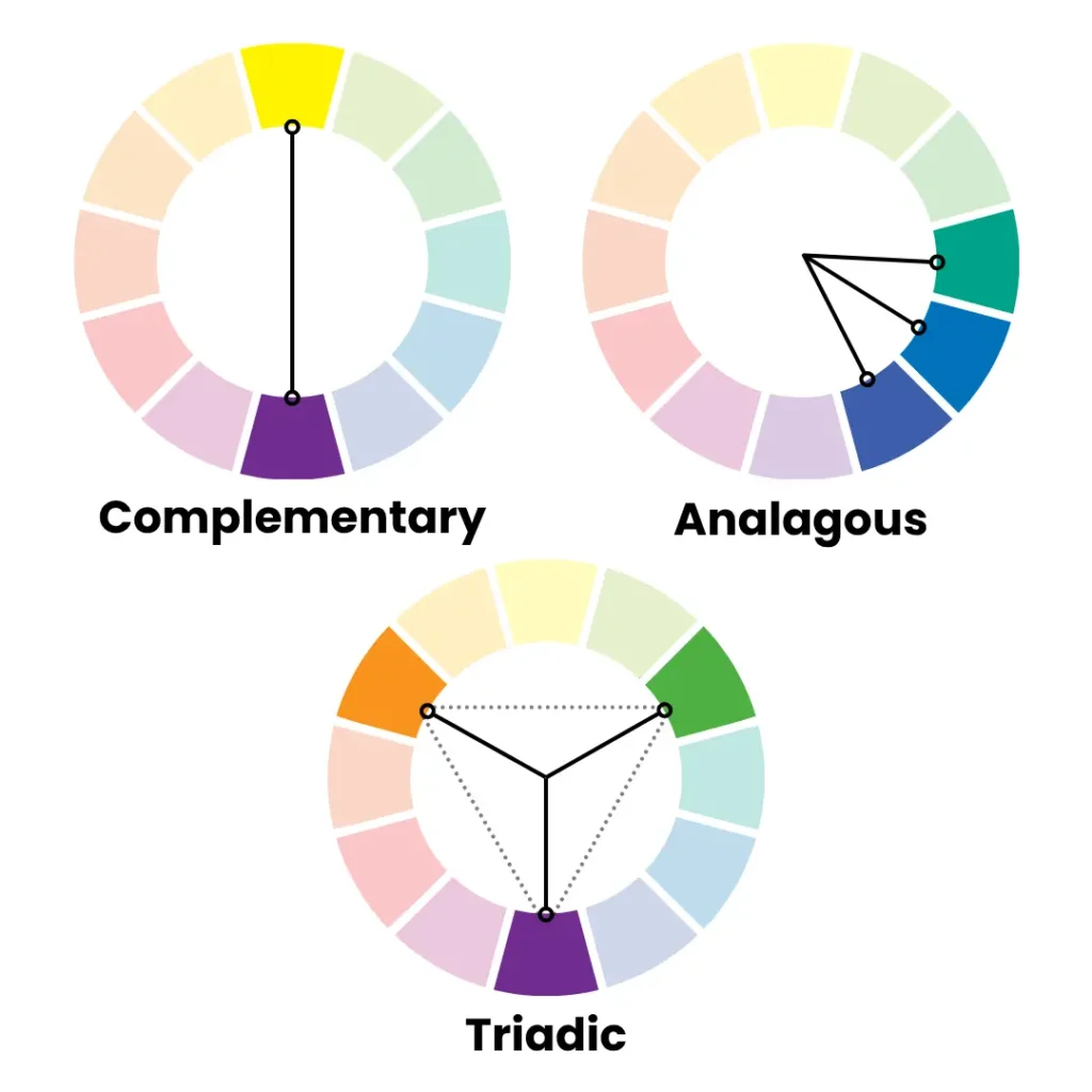
From here, experiment with the following pairings to pick out better strong accompanying colours to build your palette:
- Complementary Colours – Colours that are opposite one another on the colour wheel. They help to create an impactful, but harmonious contrast when paired together.
- Analogous Colours – Colours that are next to each other. These colours create a much closer harmony and natural flow as opposed to complementary colours.
- Triadic Colours – Three colours that are equal distances from one another on the colour wheel. They’re perfect for creating a dynamic visual interest, whilst maintaining balance.
Using the colour wheel for this process can help you to avoid picking colours that clash with one another, especially if you’re developing a site without the help of a professional designer.
Using Contrast Effectively in Web Design
Contrast is an important practice in web design, as it directly affects how easy it is for people to read, navigate, and engage with your site. When working contrast into your site’s design, you should try and aim to:
- Make Text Contrast With the Background – There should be a clear difference in brightness and colour between your text and background. This improves readability for all users, especially those with visual impairments or colour blindness.
- Make Your Calls-to-Action (CTAs) Stand Out – Use high-contrast colours to naturally draw attention to your CTAs. This visual emphasis can help increase clicks and drive user engagement.
- Create Distinct Page Sections – Alternating background colours between sections is a simple yet effective way to create visual separation. This guides users through your content and makes it easier to distinguish between related and unrelated information.
To check that your website’s contrast levels are both accessible and in line with your branding, you can use tools like the WebAIM Contrast Checker.
Applying Brand Colours Across Your Website
Once you’ve chosen a palette that suits your branding, it’s time to put it into play! Start picking out the best spots to use those colours, find out where you can draw the most attention, and what will create the best contrast. Some of the best places to start are:
- Navigation Bars and Footers – Use your brand colours here to really reinforce your identity. Let the masses know who you are.
- Headings and Subheadings – Secondary colours can really help to break up content visually here, without being too chaotic.
- CTAs, Icons, and Links – Accent colours should naturally draw attention to the user without overwhelming them.
Ultimately, your goal is consistency. Subtly reinforce your brand across each page with the same colours to avoid creating visual confusion, and build familiarity and trust.

Maintaining Accessibility and Usability
Your website could look really pretty, but it means very little if users can’t actually read or interact with any of the content on it easily. If you’re looking to keep your website looking good and openly accessible, try to keep the following accessibility tips in mind:
- Try and keep a minimum contrast ratio of 4:5:1 for any normal text on your website.
- Avoid relying solely on colour to convey information, especially if it’s important. Include labels, icons on coloured indicators to help people with colour blindness and visual impairments.
- Make sure you underline links, or find a way to visually distinguish them from normal text rather than just using colour to differentiate them.
For additional help on how to keep your website accessible, check out the Web Content Accessibility Guidelines (WCAG). Designing with these guidelines in mind helps you reach a wider audience and positions your brand positively as inclusive and user-oriented.
Building Brand Recognition Through Consistency
It’s important to remember that colour consistency doesn’t just stop at your website. It should extend to all branded web content that you create to help build a true, consistent identity across your online platforms:
- Social media posts
- Emails
- Digital ads
- Business cards and signs
Creating your own brand guidelines can help keep everyone in your business on the same page, especially if you’re hiring external workers or freelancers.
Conclusion
Whilst colour theory may seem overwhelming at first glance, it’s actually an incredibly powerful branding tool once you become comfortable with using it. By understanding the thought behind colour psychology, how to pick and choose colours to put into a palette, and how to apply them consistently, you can create a web presence that leaves a lasting impression on customers.
Better yet, colour in web design costs nothing, meaning you can skip the huge budget to make a big impact. All you need is the right strategy that properly connects with and speaks to your audience, reflects who you are, and accommodates all users for a good user experience.
If you still aren’t quite sure where to begin with your website’s branding and colours, we’re here to help. At Midland Marketing, our team of marketing professionals offers upfront web design and branding services that get your name out to the crowds. Contact us today to get started.