Introduction
In a digital world filled with all sorts of audible and visual noise, like pop-ups, banners, buttons, and endless blocks of text, it can be hard to compete. And with all this noise, it may be tempting to think that more is better, when in fact it’s the opposite.
The answer often lies in using less clutter, which is where white space comes in.
White space refers to the empty areas between design elements. It’s important to bear in mind that white space isn’t blank space, and is instead an essential tool for visual communication that helps guide the eye, improve readability, and create a more polished, professional appearance.
In this article, we’ll explore what white space is, why it’s such a valuable web design tool, and how you can embrace it to create clearer, more effective websites.
What is White Space?
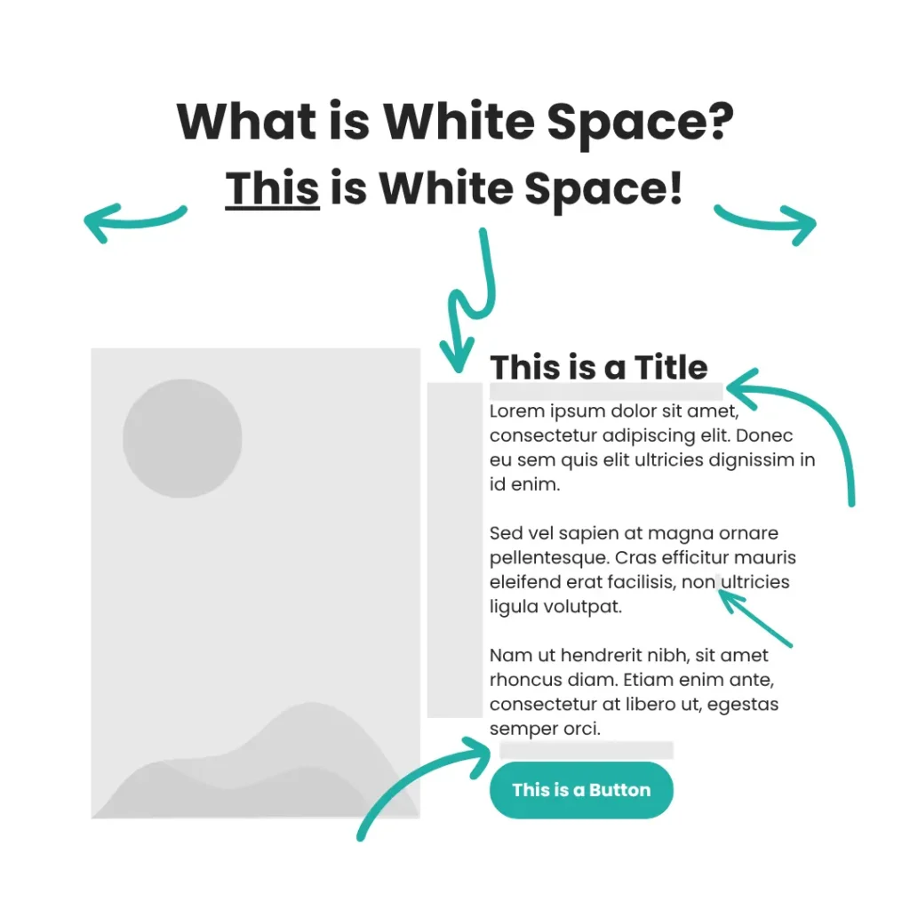
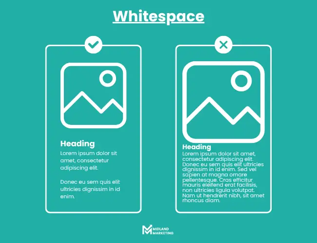
White space, sometimes known as negative space, refers to the empty areas around and between design elements. And despite the misleading name, white space doesn’t have to be white. It could be your background colour, a texture, or even an image, just as long as it doesn’t contain core page content.
You’ll find white space between:
- Headings, subheadings, and paragraphs
- Images and captions
- Buttons and form fields
- Menu items
- Margins and other forms of padding
It’s a fundamental tool for visual communication, helping to naturally guide the eye, improve readability, and create a more polished and professional appearance for your site.
Why White Space is Crucial for Web Design
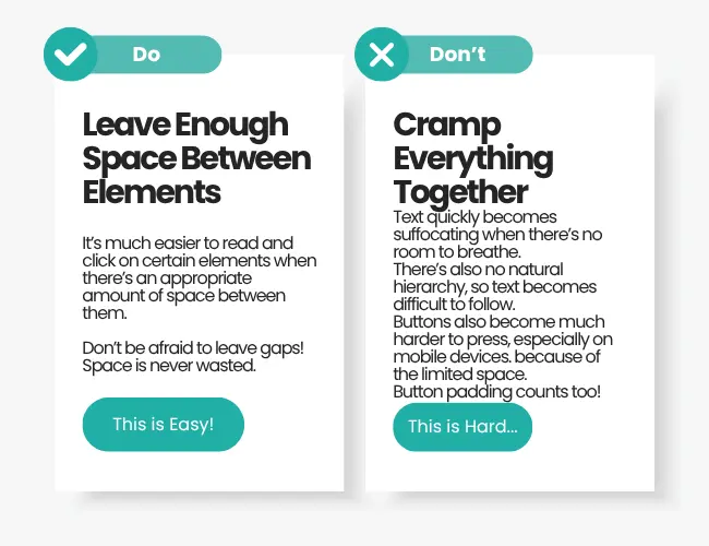
Anyone who owns a website knows that white space is a powerful tool for attracting, engaging, and converting users, especially in business settings. The strategic use of white space helps your website feel organised, professional, and user-friendly.
Without it, your web design could end up turning potential users away because of a cramped and suffocating design. It needs to be strategically used to create visual focal points that naturally draw consumers in and guide them to all the information they need to know.
Here are some other ways that white space can benefit your website:
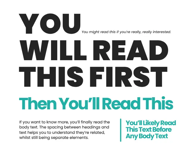
1. Improved Readability
No one wants to read what looks like an endless wall of text. It can cause eye strain, it can be difficult to focus, and it makes readers feel tense. White space helps to break content up into manageable chunks, making it much easier to skim and digest content. This is especially important for mobile users, who need clear, spacious layouts to read comfortably on smaller screens.
Small tweaks like increasing line spacing (leading), the gaps between characters (kerning), or padding around text can make a significant difference in how easily visitors digest your page content.
2. Guided Attention
It helps to think of your website like a map. White space helps create visual hierarchy, which is a natural flow that subconsciously tells users what to look at first, second, and so on.
If used well, you can subtly direct attention to important calls-to-action (CTAs), special offers, or any other core page content. By using space intentionally, you control the narrative of your site and guide users where you want them to go.
3. Modern Design
It’s no secret that modern brands have begun to embrace minimalism more and more. Clean and spacious layouts are beginning to become more desirable, conveying a sense of confidence and clarity to users navigating a website. Busier or more crowded designs, on the other hand, can feel a lot less professional.
Even if you’re a small business, just starting out, you can give your website a premium feel purely by making better use of the space in your website design.
4. Better User experience
User experience is no longer about making your website look nice and calling it a day, but rather, it’s about making things easy for your users.
Cluttered pages can be incredibly difficult to navigate, especially on mobile, with so many places trying to draw your attention. This will inevitably increase your bounce rates.
However, if you use appropriate spacing between elements, buttons become easier to click, content is easier to read, and the whole site becomes more pleasant to use.
5. Encouraged Action
When you remove unnecessary distractions from your website, users are much more likely to take the action you want them to take. Clear layouts help visitors focus on what you want them to do, whether it’s signing up for a newsletter, making a purchase, or getting in touch with your team.
Why You Shouldn't Be Afraid to Use White Space
It’s not uncommon for people to hesitate when it comes to the idea of leaving a “blank” space on a page. It can feel like wasted potential. Space where you could have squeezed in another product, offer, or extra text.
However, it’s important to remember that white space isn’t empty. It’s strategic. It’s there to support your message, to give your most important elements room to stand out, and to reduce the noise that stops users from seeing what truly matters.
Think of it like a shop window. If you try to display everything at once, people won’t know what to look at. But if you carefully showcase just a few items, arranged with space and intention, they’ll notice, and be more likely to remember.

How to Use White Space Effectively
- Review Your Website’s Layout – Are your pages too crowded? Are there any sections you could simplify? Is there anywhere you could create more breathing room?
- Use Padding Generously – Avoid cramming elements too close together. Use padding around text, images, and buttons to improve the flow of the page.
- Group Related Elements – Create visual “sections” by grouping similar content, then separate them with white space. This ties in to Gestalt Principles, more specifically, the law of proximity. It states that items with less space between them are considered more related than items with more space between them. Use this to your advantage.
- Avoid Cluttered Navigation Menus – Focus on what matters most to the user journey. Don’t overwhelm users with unnecessary choices — instead, only give them the most relevant and important information they might need.
- Be Intentional -Allow every bit of space on your website to serve a purpose, whether it’s directing attention, improving clarity, or simply giving users a space to rest their eyes.
Conclusion
For those looking to stand out online, whether you’re a business or an individual, white space offers a powerful advantage. It makes your website feel cleaner, clearer, and more professional.
More importantly, it helps visitors navigate your content, understand your value, and take actions that grow your business.
Don’t just fill every possible corner of your website just because. Give your content the room it needs to breathe and flourish, and your users the space they need to engage.
If you’re looking for additional help with building and designing your website, we’re here to help. At Midland Marketing, we offer transparent web design services that bring your mock ups to life.